Visit Palm Springs
Bold, Local, & Inclusive: Palm Springs
Role
Art Direction • UI Design
Scope
Discovery & Research • Art Direction • UI Design • Graphic Asset Suite
Agency & Year
Simpleview | 2024
Year
Brand Identity & Packaging Design
Thanks to
Visit Palm Springs Team
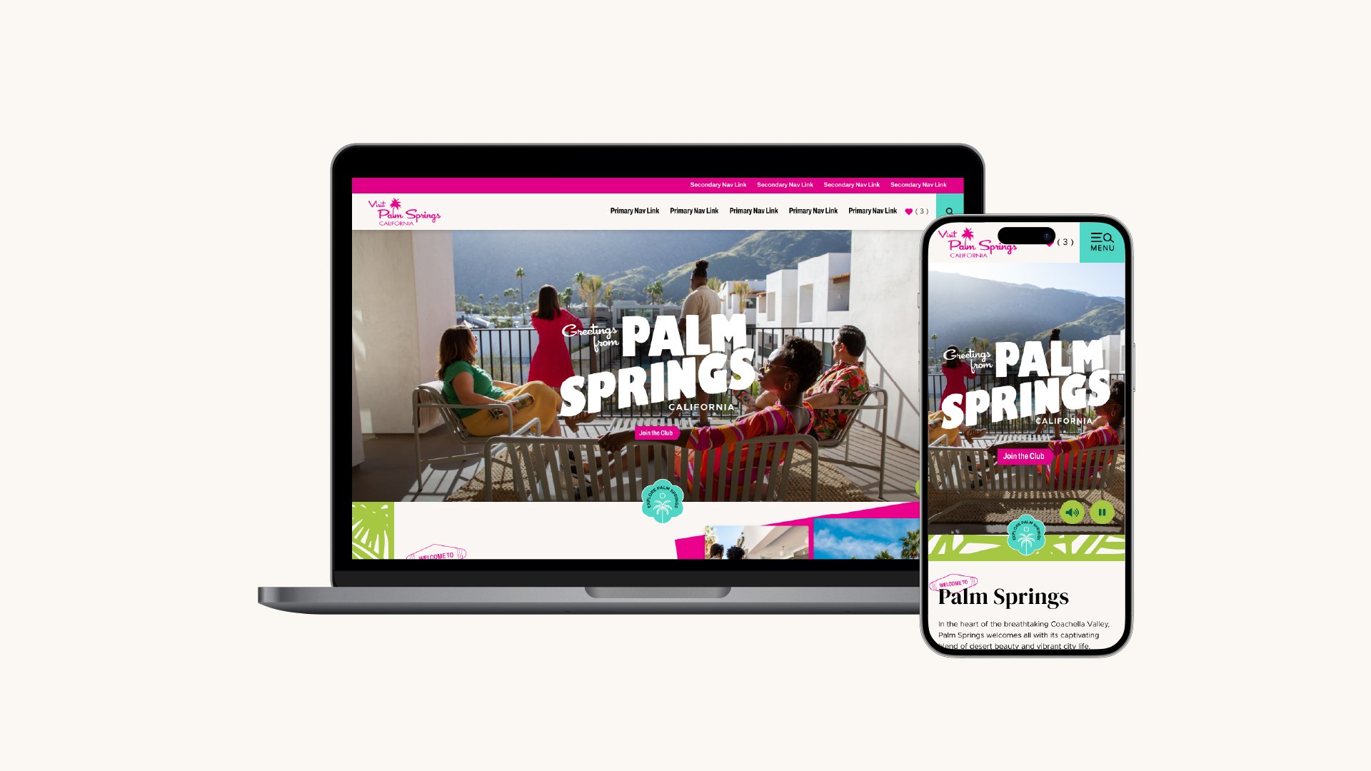
Visit Palm Springs is the DMO that encompasses the city of Palm Springs, sitting within the larger DMO representing all of the Coachella Valley. The self-described edgy little sister of Visit Greater Palm Springs wanted to represent all the aspects of their city, the midcentury aesthetic, the old Hollywood glamour, their partnership with the local Native American population, Agua Caliente Band of Cahuilla Indians, and their reputation as a premier LGBTQIA+ destination. The project increased total account value by 20%, adding $227K in new contracts and boosting annual recurring revenue to over $645K. The redesign's success led to a request to redesign Greater Palm Springs' site, and sparked rebrand conversations with 8 neighboring cities.
The Full Story
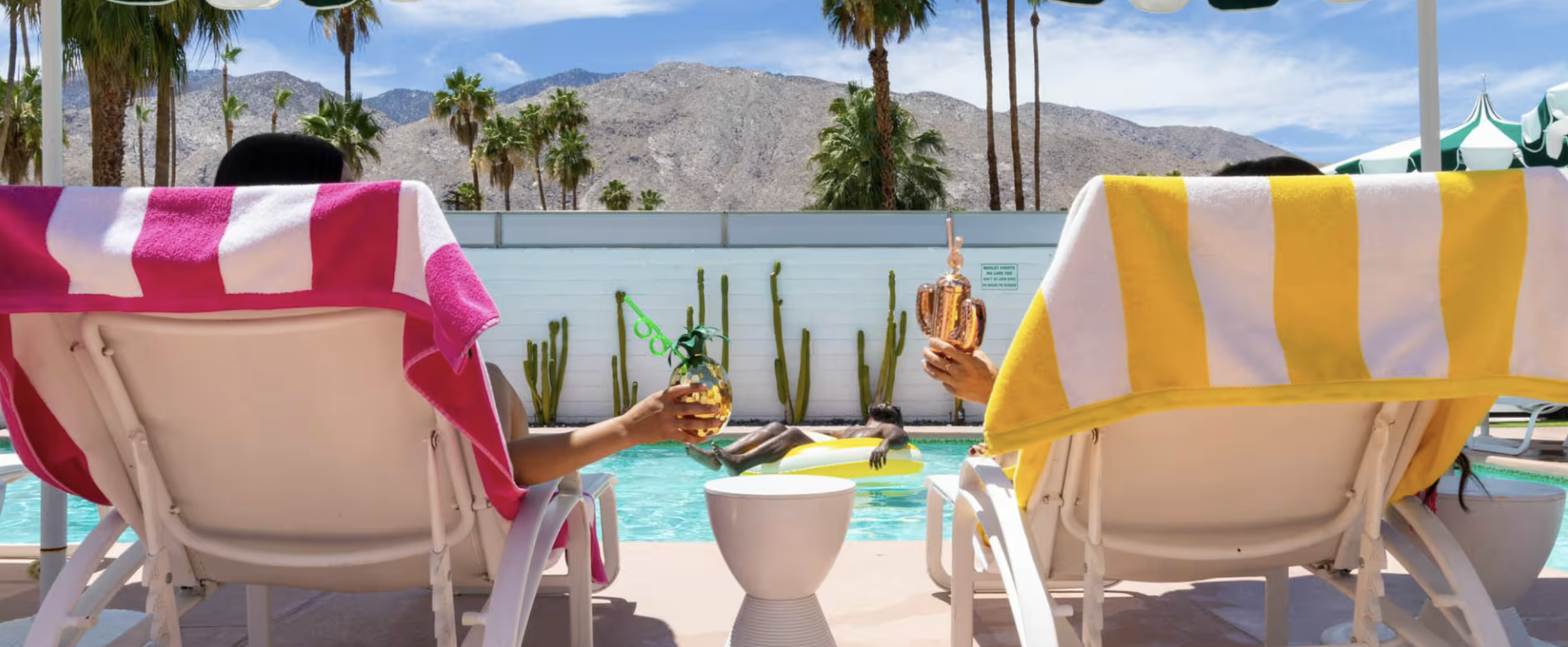
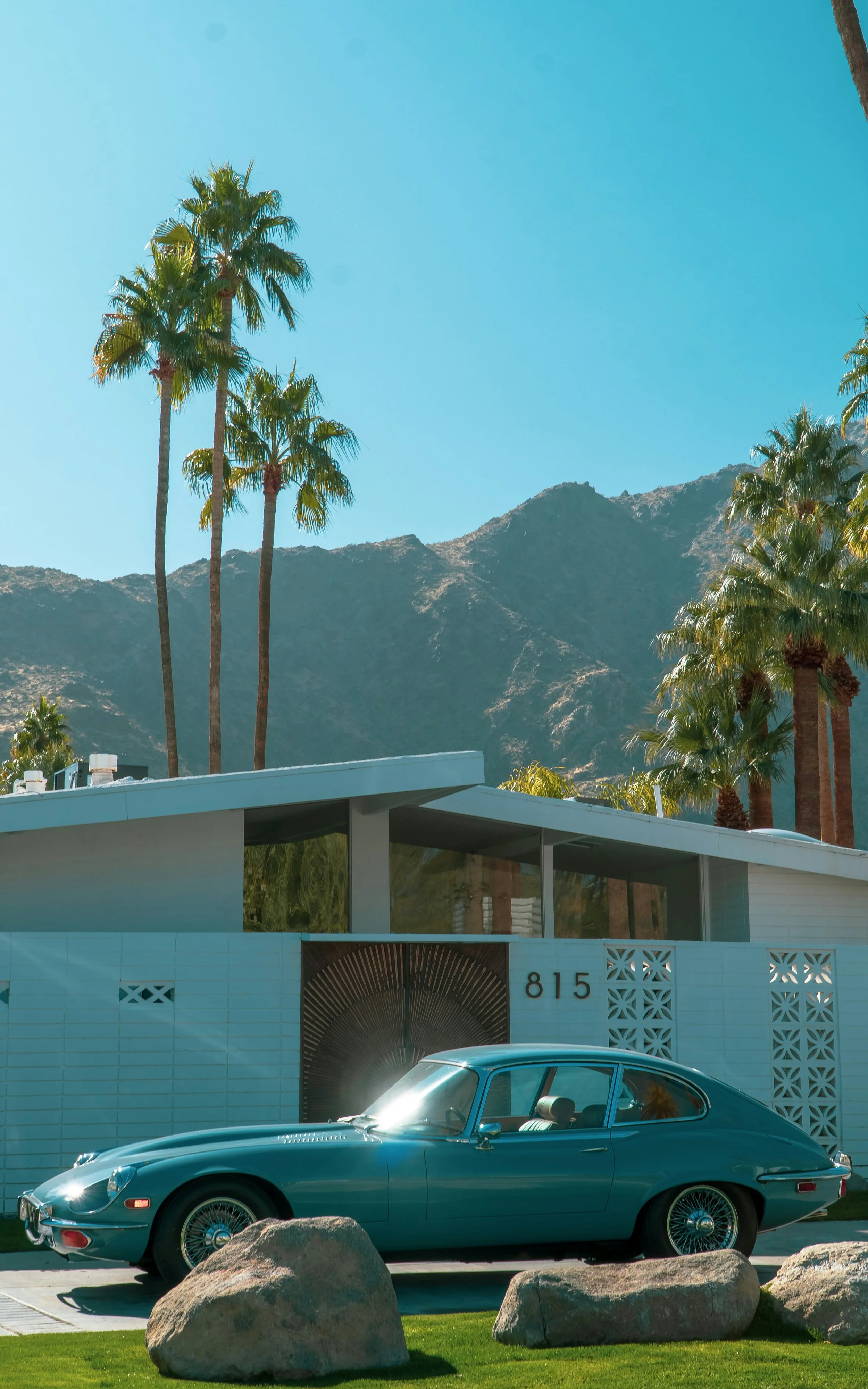
Before the design work started, we spent time in Palm Springs, discovering all there was to see: boutique hotels, cultural museums, valleys full of palm trees. Collaborative discovery sessions with the client helped to define the destination’s personality, key performance indicators, and the target audience. Many pieces of the city are directly referenced in the elements of the website.
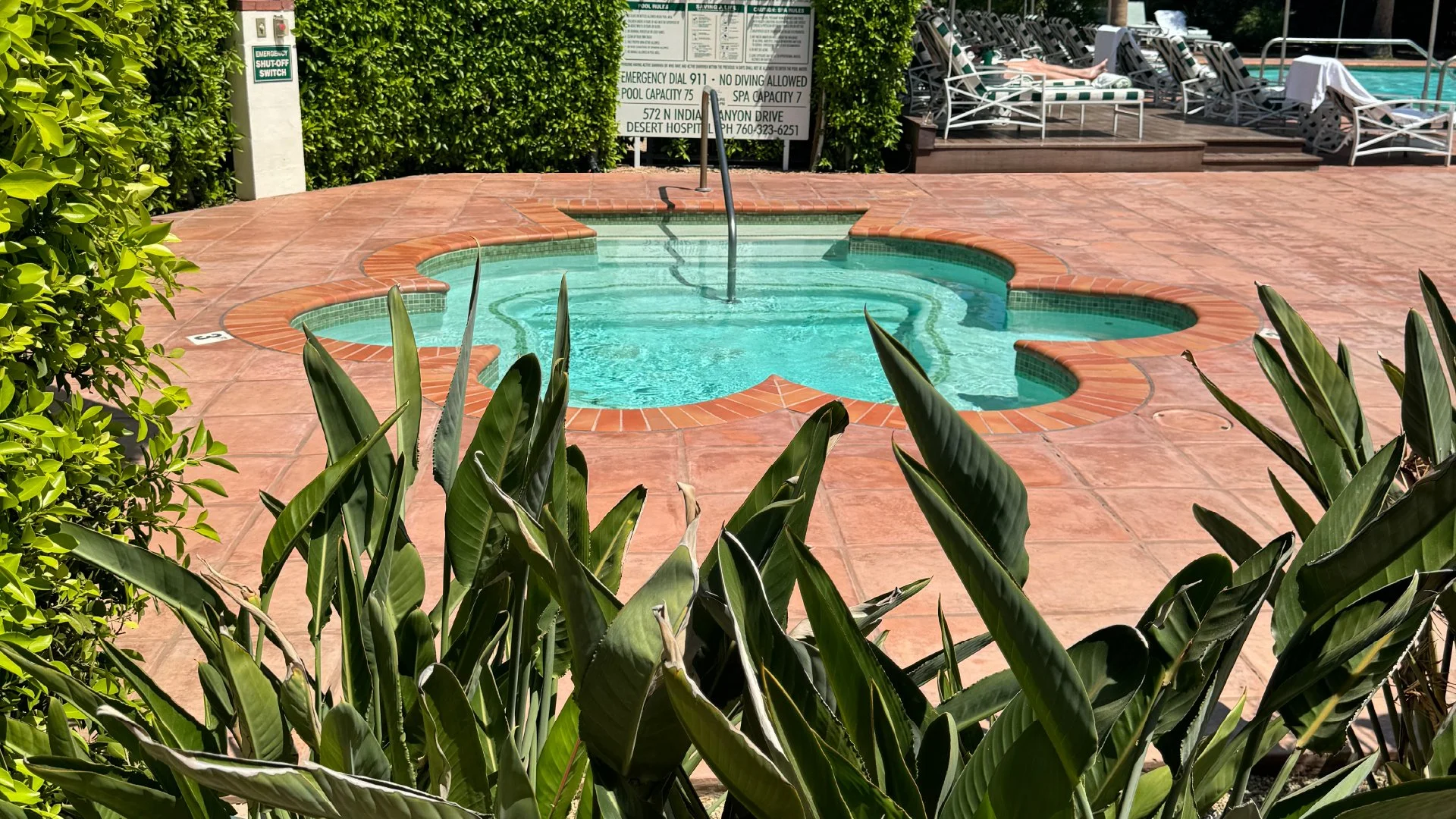
The client put it best during discovery, describing themselves as "the edgy little sister of Greater Palm Springs." That line became the brief. Instead of a soft high end luxury feeling, I pushed the art direction into bright neon pinks and greens, bold patterns, and funky shapes. Breezeblock became a border, the shape of the pool that Judy Garland hung out in became a recurring shape motif, the palms of the valley bordered photographs.
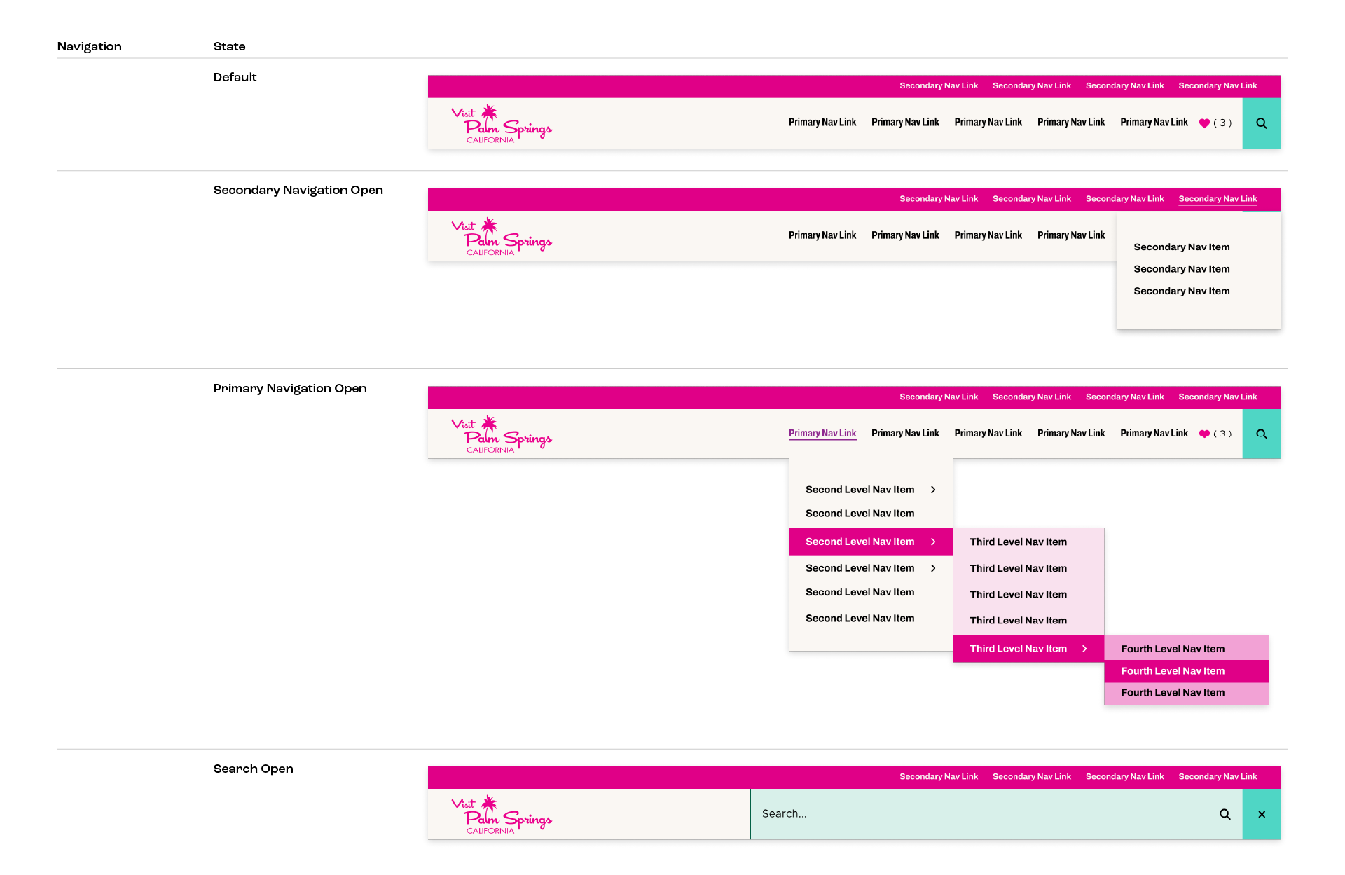
Typography followed the same research, a serif headline gave a nod to midcentury design, which offered a refined counterbalance to the boldness of the color system. From there, I built out a full suite of UI elements, buttons, icons, patterns, so the visual language held together across the entire user experience.
Underneath the visual system, every decision was built to move a specific metric, Visitors Guide requests, partner referral visibility, blog and event engagement, while still feeling like a site people would actually want to spend time on.
The site launched on time and under budget. It increased total account value by 20%, adding $227K in new contracts, and boosted annual recurring revenue past $645K. The work also led to a follow-on request to redesign the Greater Palm Springs site, and sparked rebrand conversations with 8 additional neighboring cities.