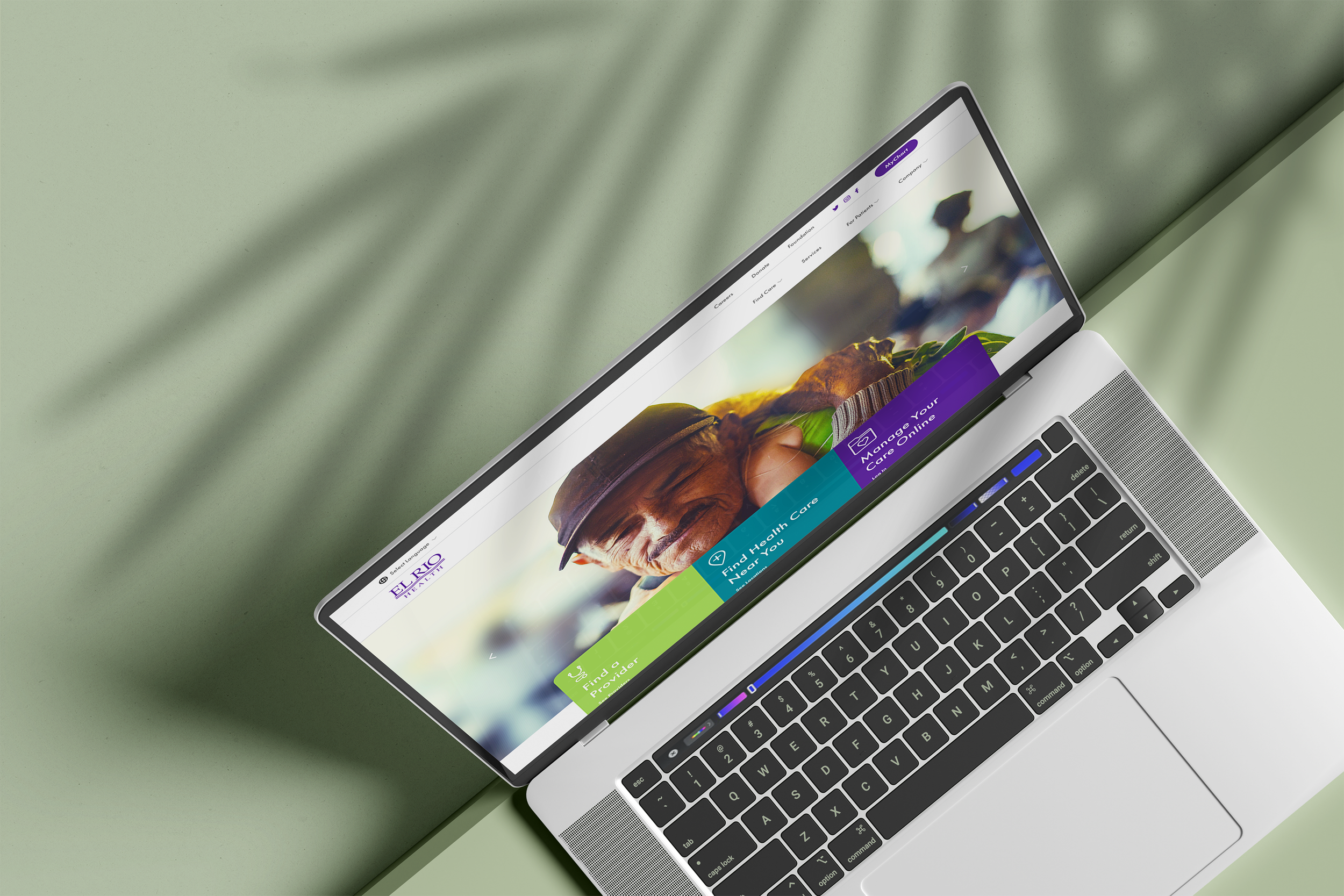
El Rio Healthcare UX Strategy & Website
Accessible, Human-Centered Healthcare
Role
UX Strategy • Website Design • Custom Icons • Photoshoot Processing
Scope
Custom Photography & Icons • UX Strategy • Website Design • Photography
Agency & Year
Hydrant LLC | 2022
Thanks to
Asher Henson - Art Direction
Molly Condit - Photography
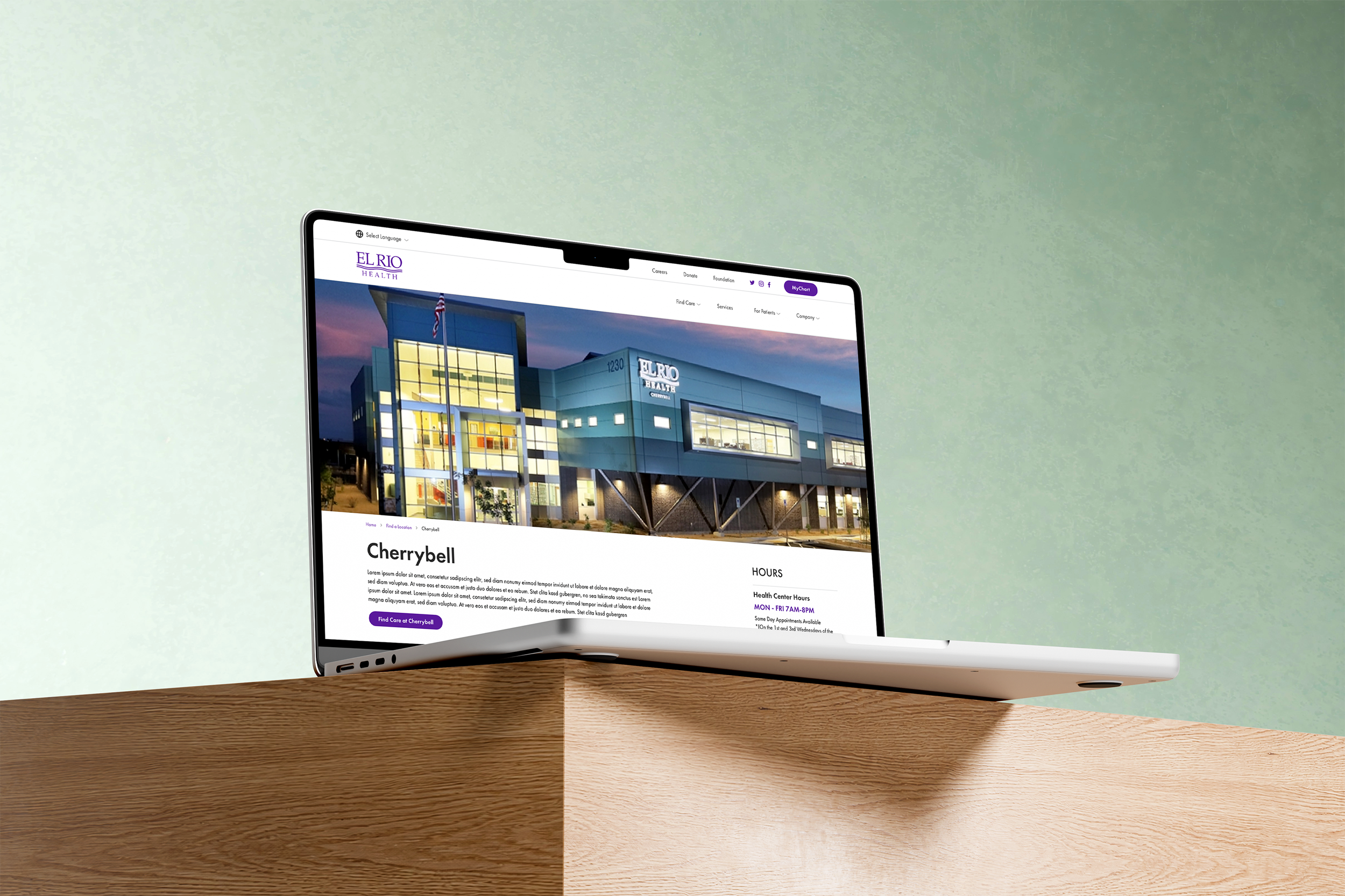
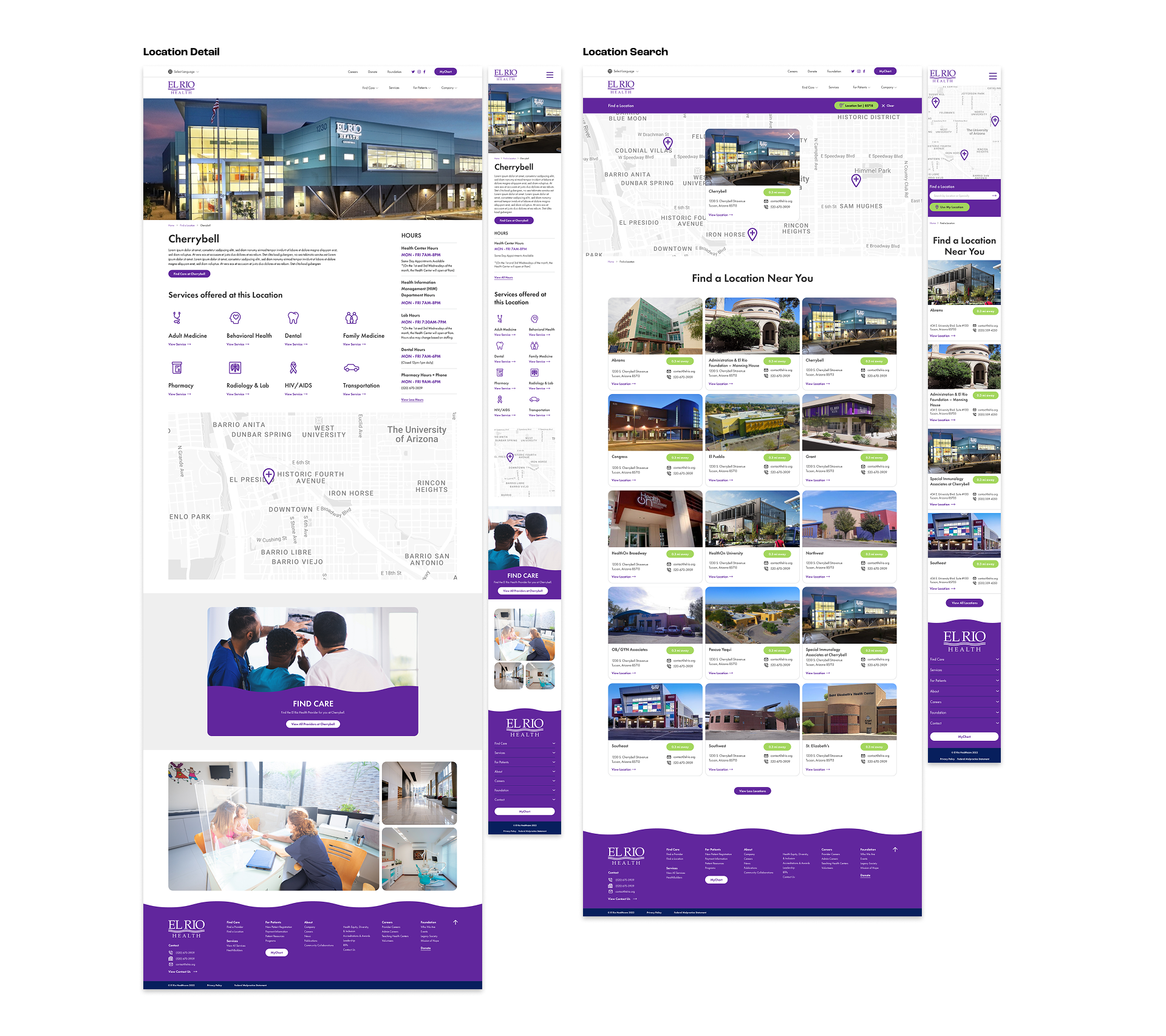
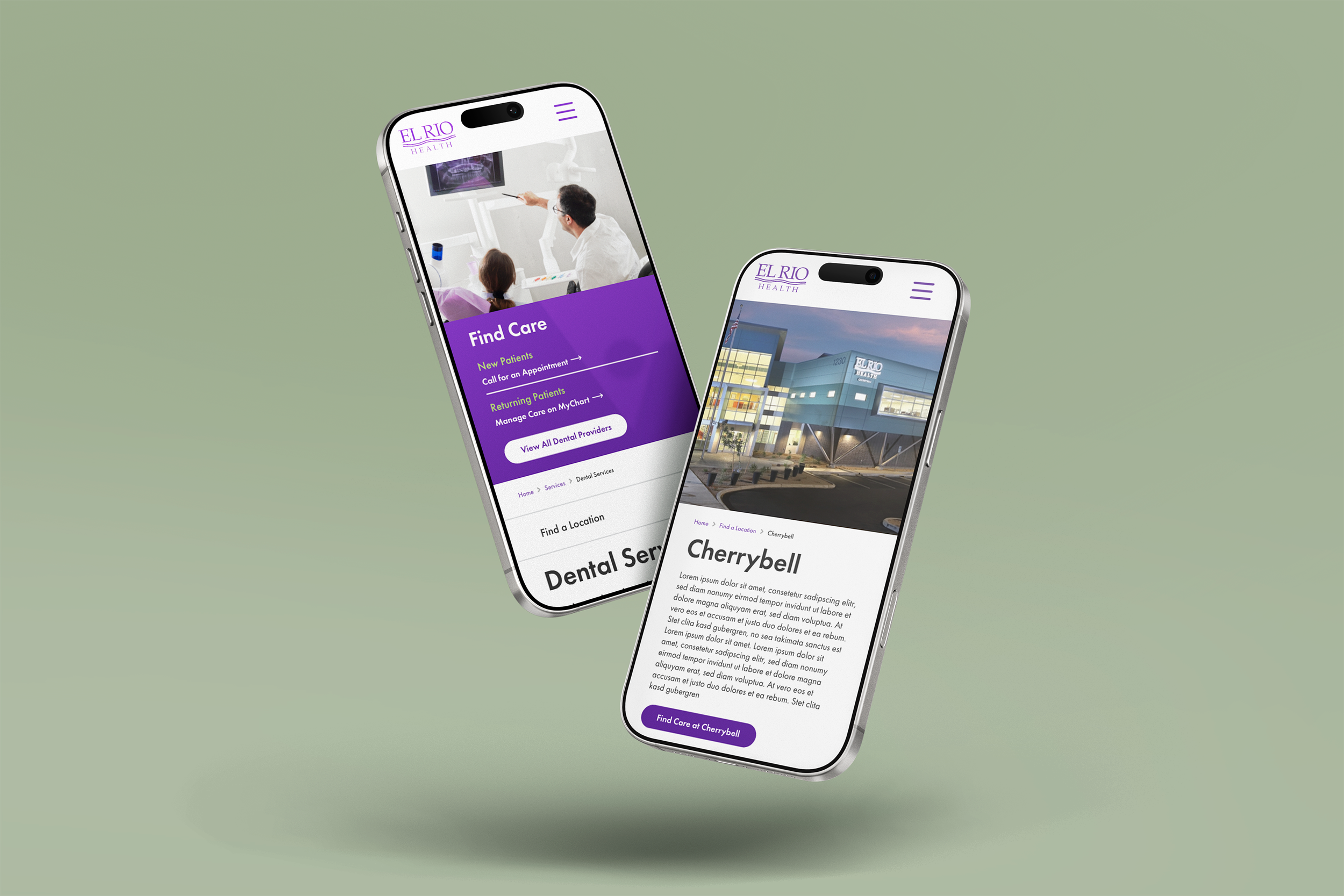
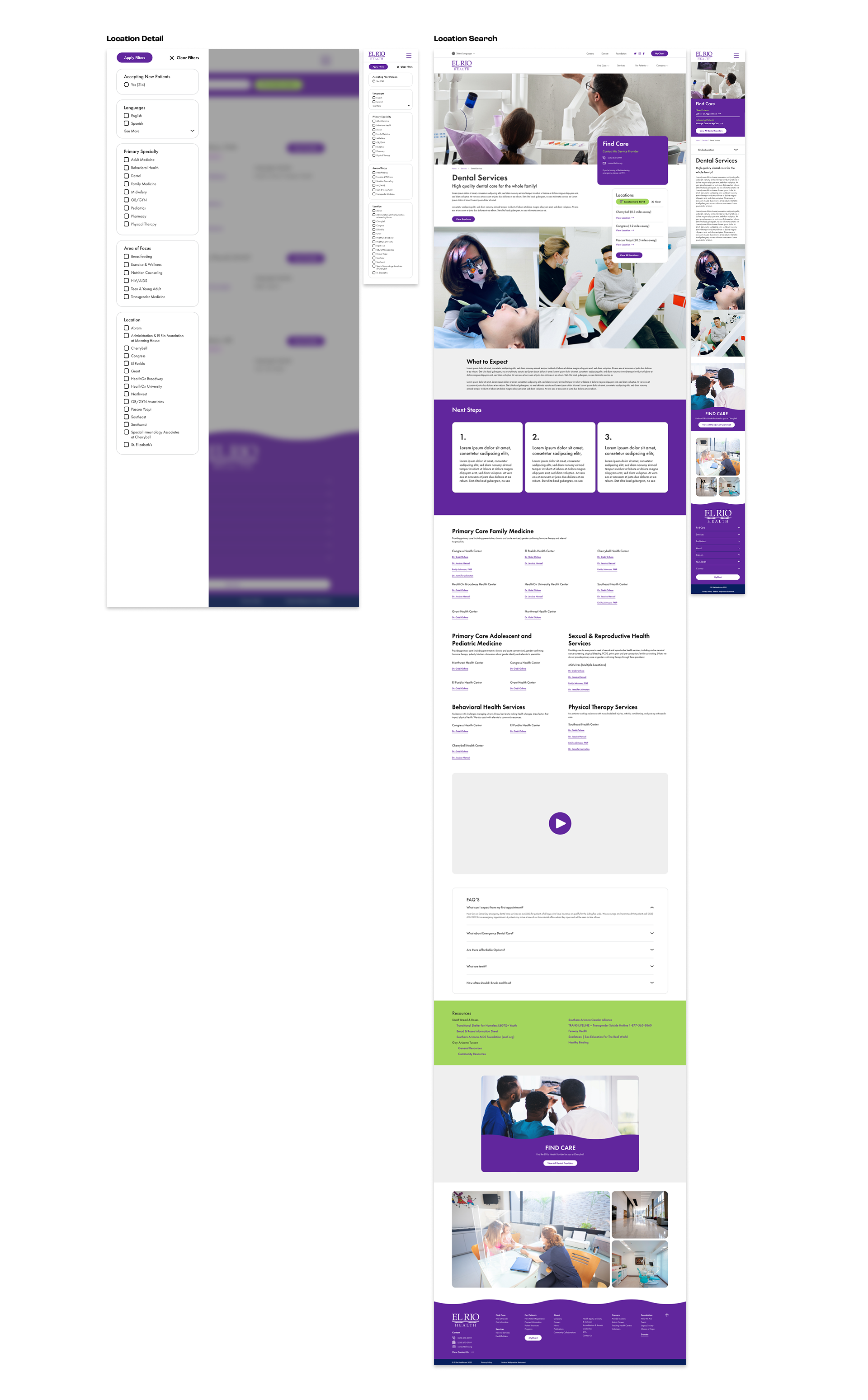
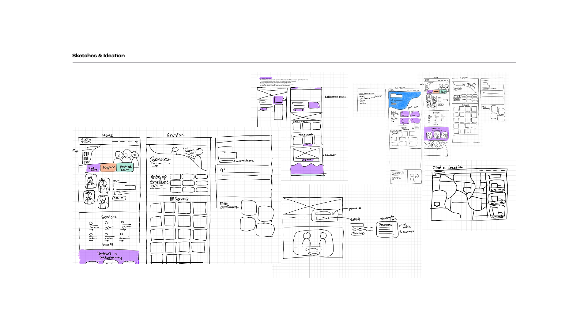
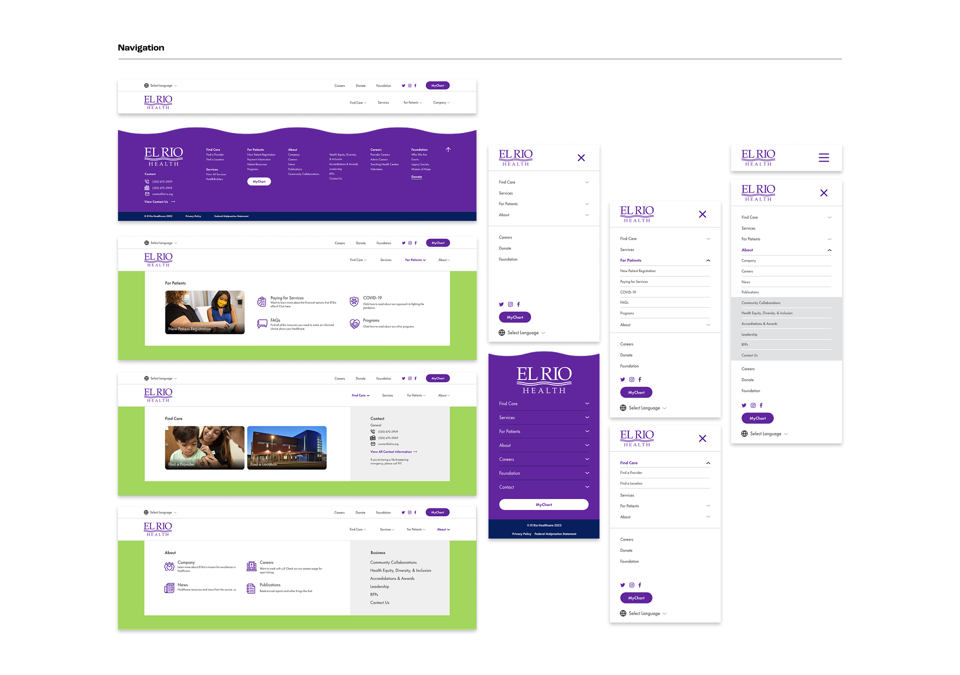
Everyone knows how hard the American healthcare system can be to navigate. My goal for the community health center, El Rio, was simple to state and hard to execute: whoever landed on the site should be able to find what they needed in three clicks or less. I led UX strategy, website design, design of 20 custom service icons, and the post-photoshoot editing to build out a website that serves El Rio's full network: 15 locations across Pima County, offering vital services from primary care to specialty services like midwifery and transgender medicine that deserve the extra care to get right.
The Full Story
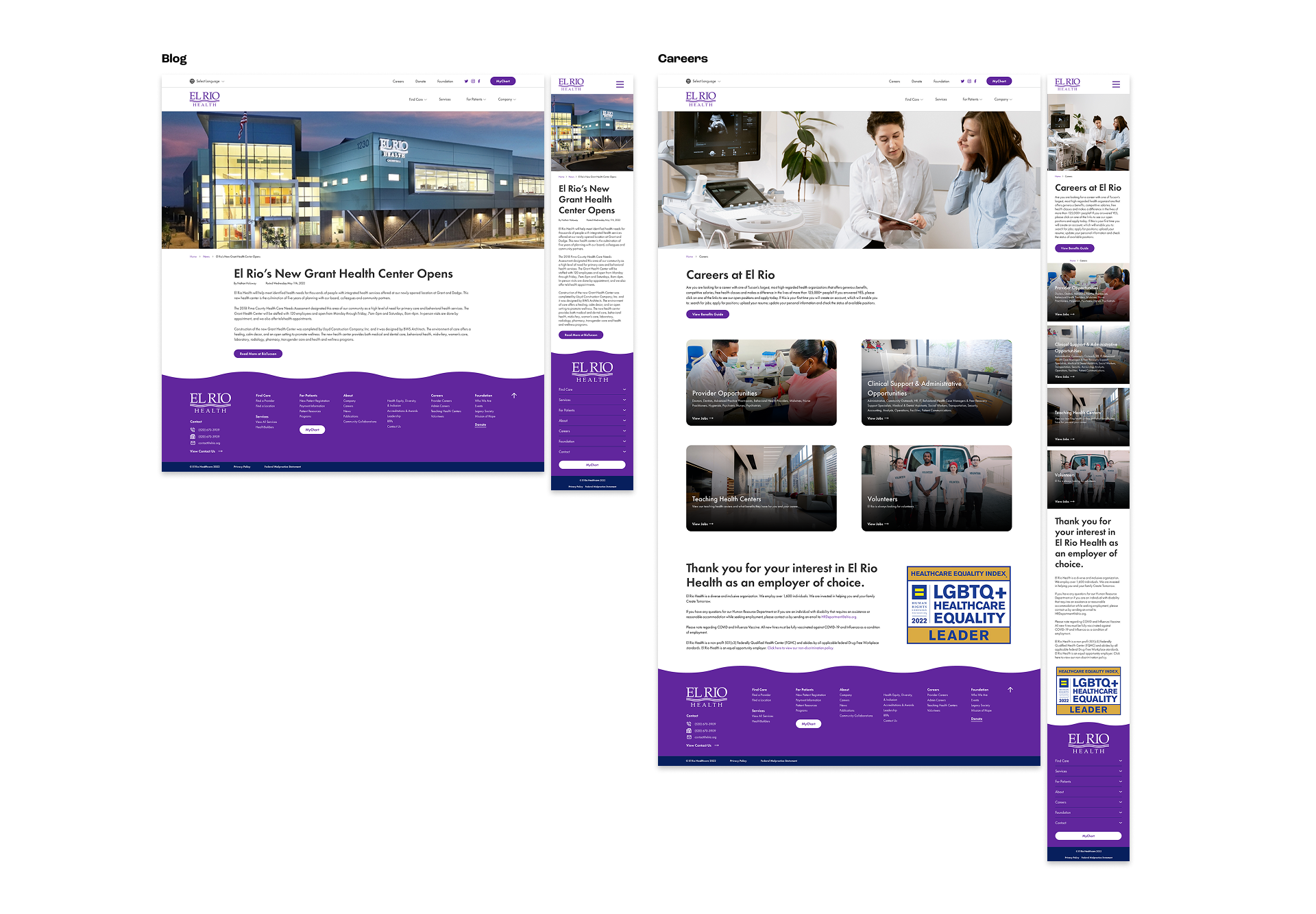
El Rio serves every corner of Pima County, regardless of a patient’s ability to pay, which meant the website had to work for radically different groups of people arriving with radically different needs. I built the UX strategy around El Rio’s four primary audiences: new patients trying to find trustworthy care for the first time, returning patients who just needed a fast path to their provider or next appointment, people browsing job openings drawn in by El Rio's mission, and donors looking for a clear, transparent view into where their support went. Every navigation decision traced back to one of those four and what they'd actually be searching for the moment they landed on the site.
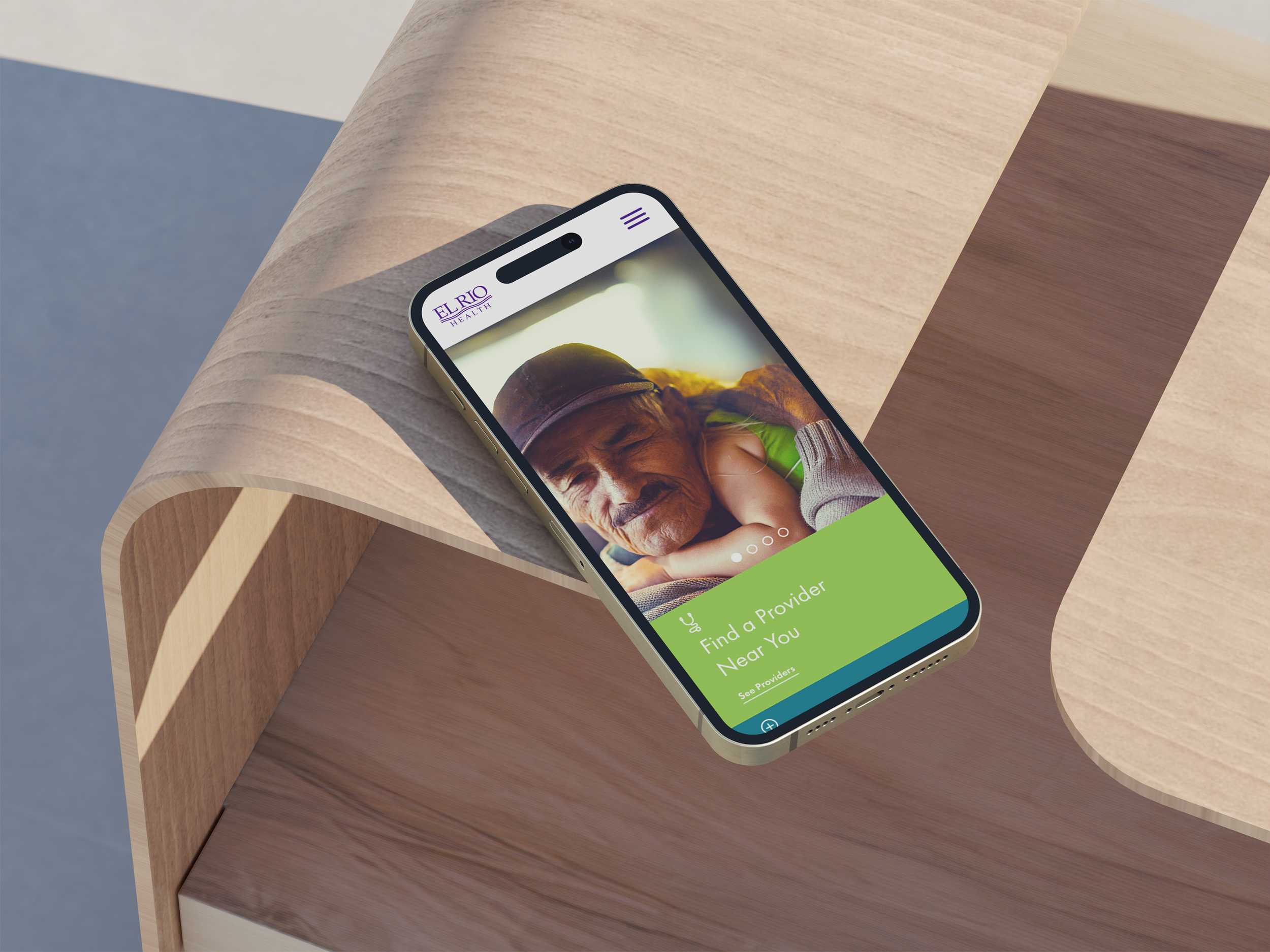
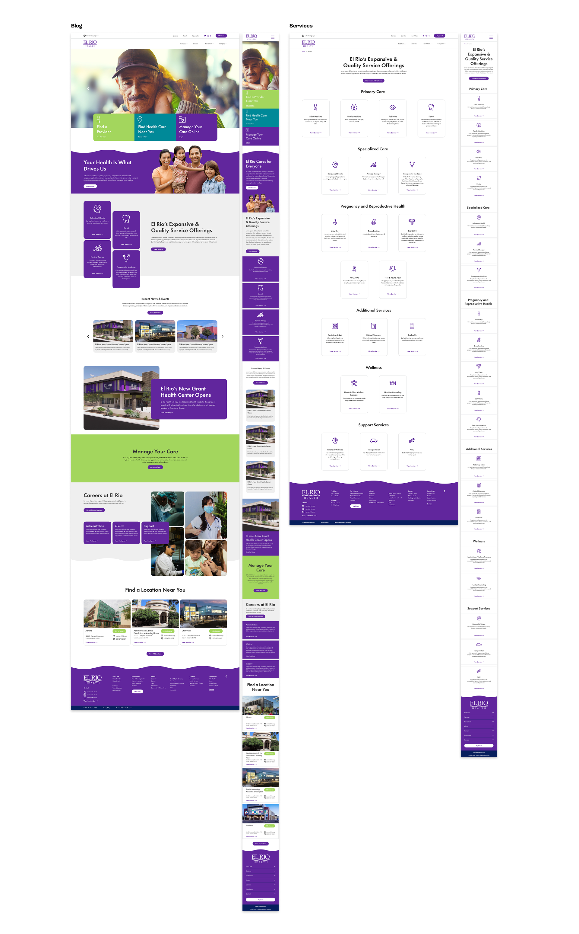
The old website buried a lot of what El Rio actually offers, 15 locations and a service list that includes specialty care and community programs that many first-time visitors wouldn’t expect from a community health network. We rebuilt around visual navigation instead of dense text lists, custom iconography for every service and photography that was woven directly into the menu as visual cards.
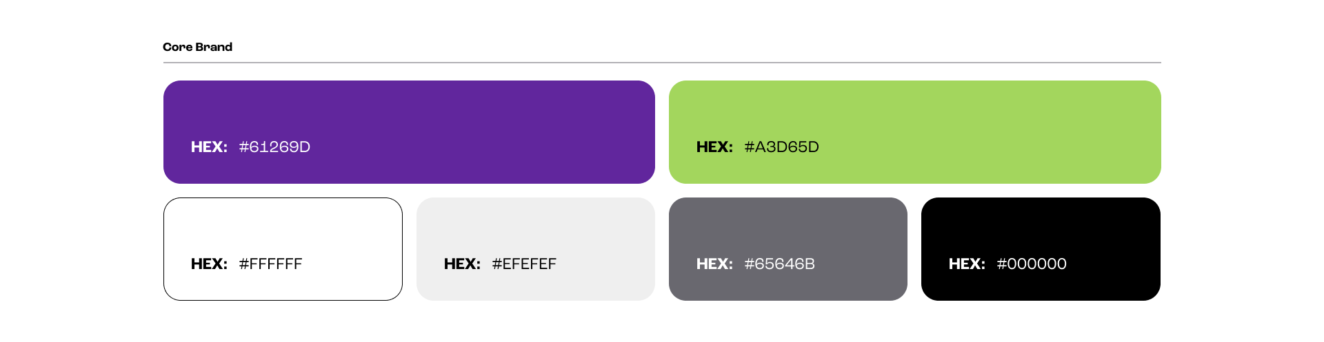
El Rio's existing brand ran on purple and lime green, and part of the job was modernizing the site without losing that identity. We pulled back to a base of white, grey, and black, then let the purple and lime green live in the UI itself — buttons, cards, the small moments of color that guide someone through the site rather than compete with the content.
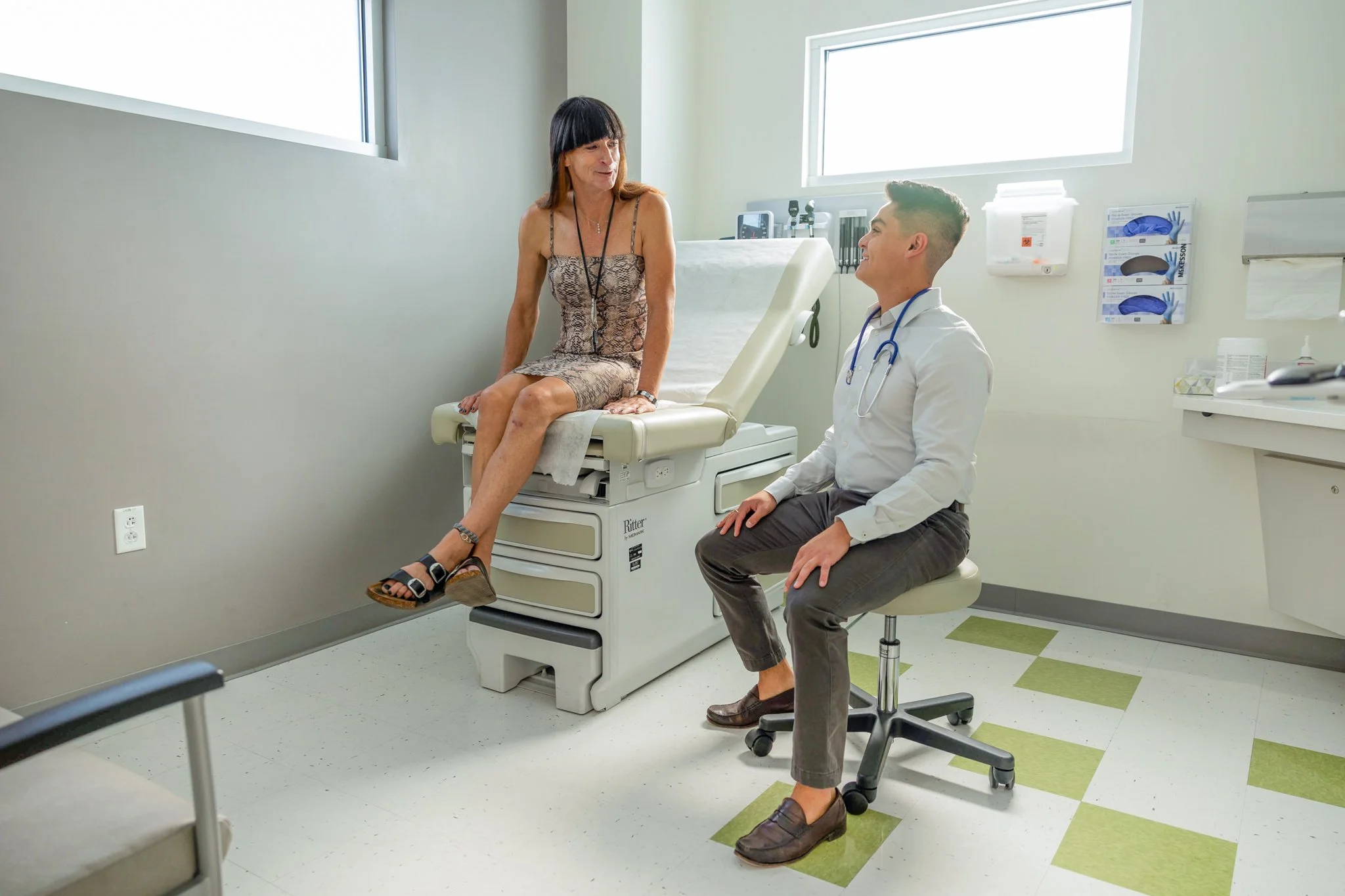
El Rio commissioned a full photoshoot across their locations and services, casting models who actually reflected the community they serve, a real range of age, race, ability, and gender identity. I spent significant time in the raw files afterward, editing every image so the final library felt warm and welcoming rather than clinical.
User Personas
Individuals seeking accessible, trustworthy healthcare for the first time. Their priority is finding clear information about services, locations, find a provider, and register for services.
New Patients
Returning Patients
Patients familiar with El Rio’s care who need quick access to medical services and to find potential providers.
Potential Applicants
People exploring job opportunities, drawn to El Rio’s community-driven mission and seeking a clear view of career paths and workplace culture.
Community members eager to make an impact, looking for transparent details about El Rio’s initiatives and how their contributions benefit the community.
Potential Donors