Visit Wayne County Ohio Visual Identity
Branding for a Heartland Community with Heart
Role
Brand Identity • Website Design
Scope
Brand Strategy • Visual Identity • Website Design
Agency & Year
Simpleview | 2023 – 2024
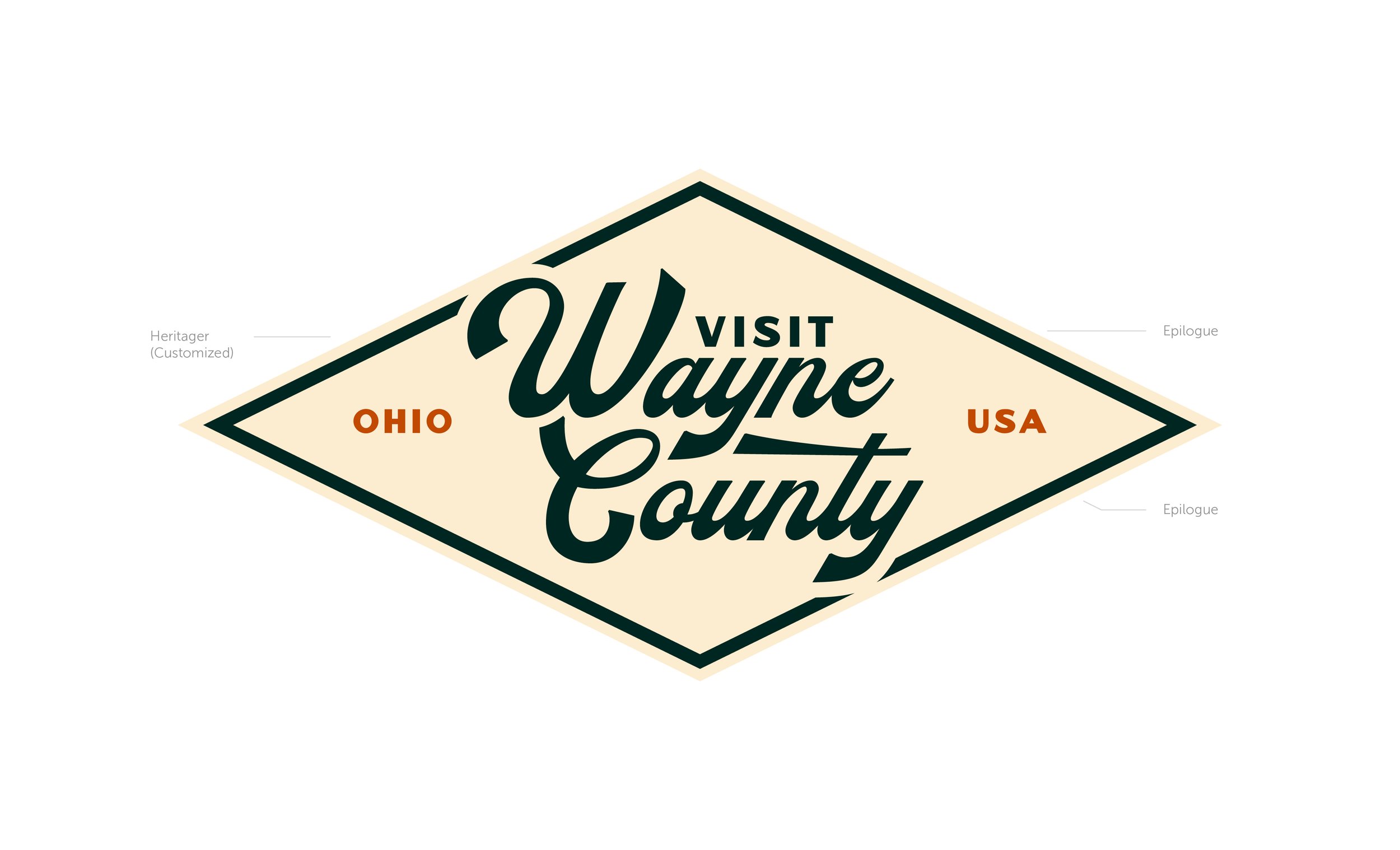
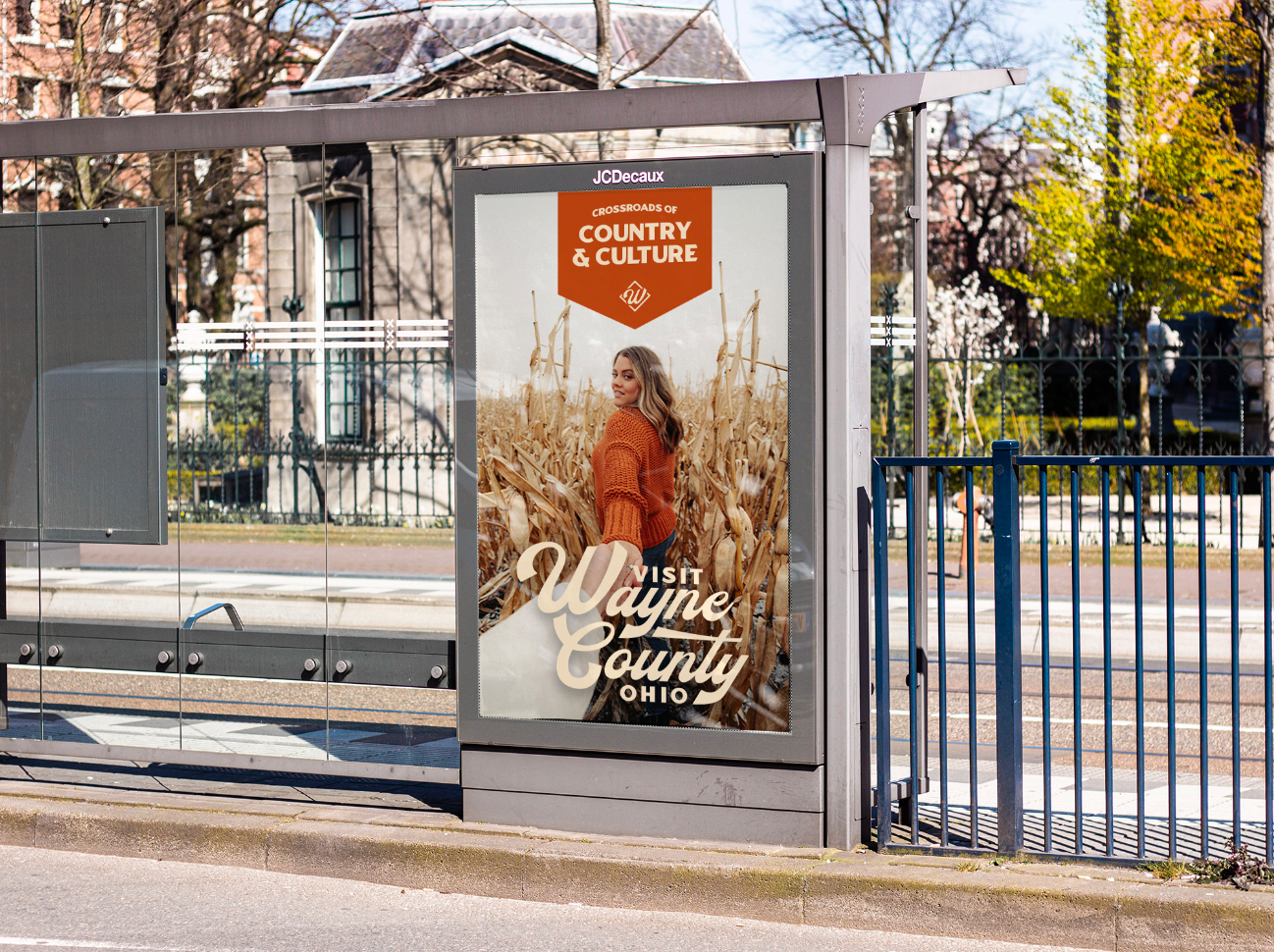
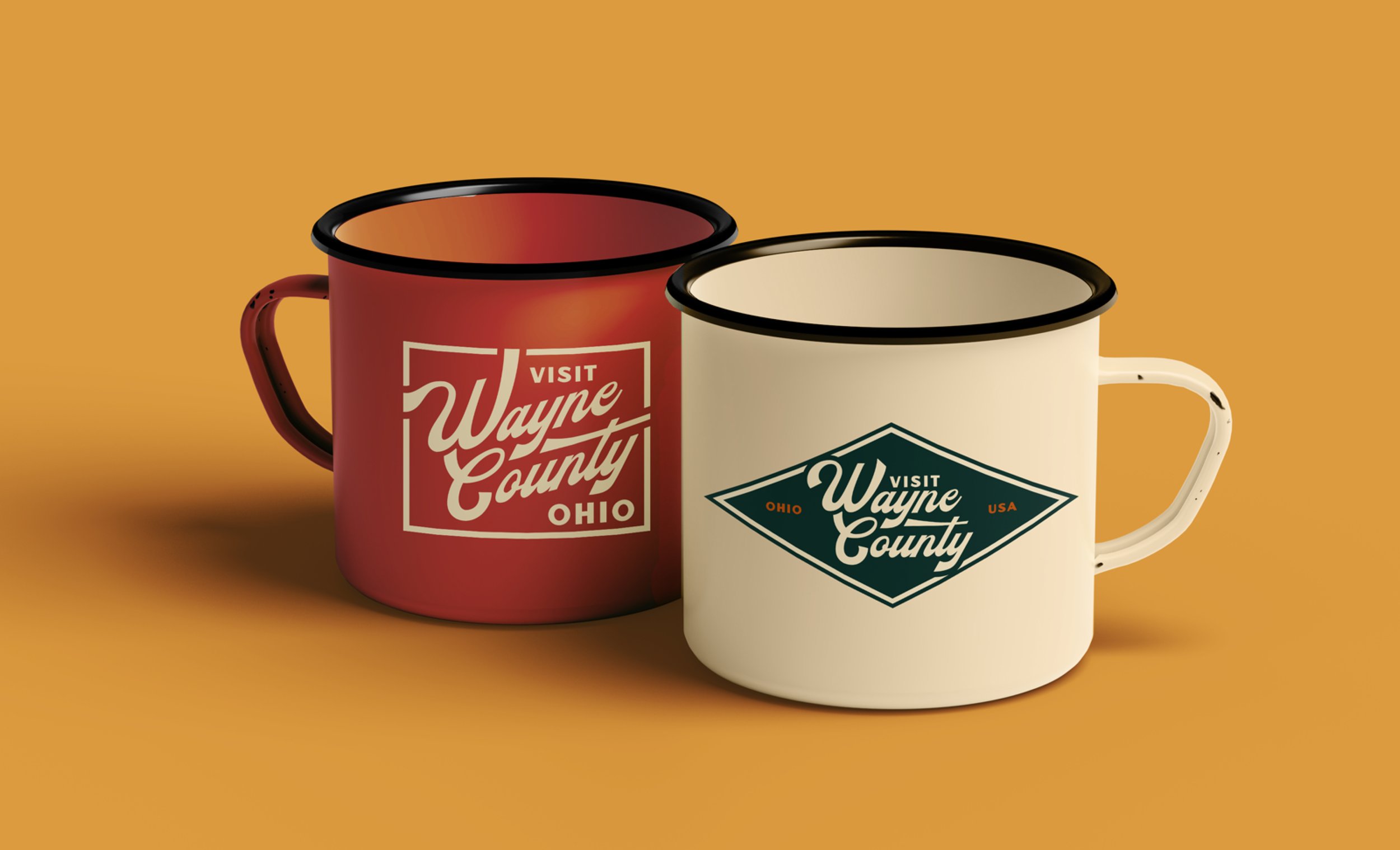
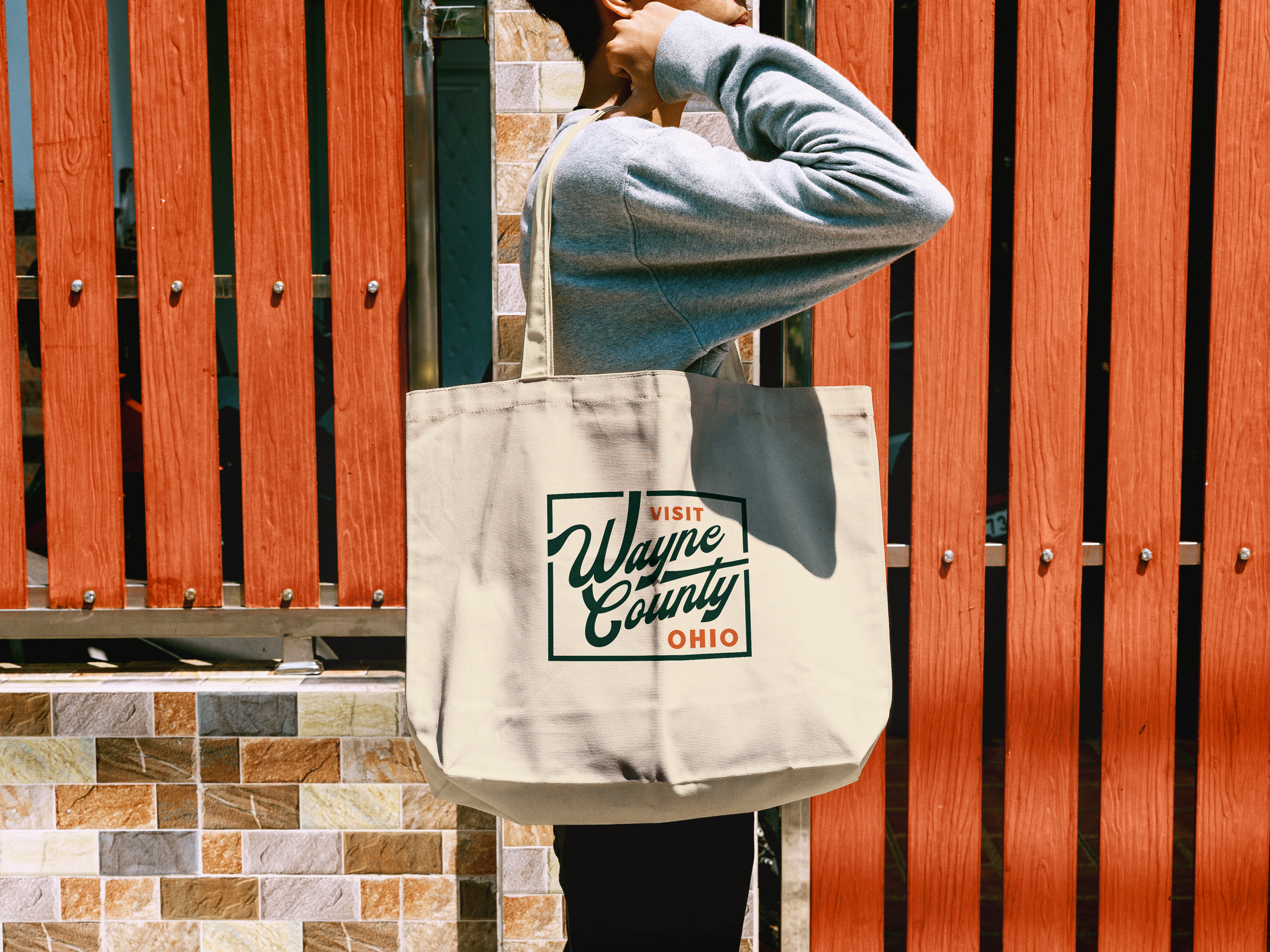
Wayne County, Ohio’s greatest strength isn’t its beautiful scenery, it’s community. This heartland county sits in the middle of rolling hills, red barns, and one of the largest Amish populations in the US. The core of the identity encompassed all of this in a typographic badge system modeled on the stamps that furniture makers have used for generations. It turned the county’s own craft heritage into a literal mark of pride. The system scaled across a main logo system, regional sublogos, and a KPI-driven website. It was all approved with no revisions and was called “the perfect logo” by the client.
The Full Story
I ran a full discovery process, doing a competitive and regional analysis, and defining the personality and attributes that would carry through the visual system. One complication shaped the research more than anything: Wayne County isn't the only Wayne County in the US. So alongside the regional competitive set, I ran a second analysis against other counties sharing the name. A few things stood out, most competitors' logos were overcomplicated and needed room to breathe, few used distinctive typography, leaning instead on generic sans serifs, and blue showed up as the default primary color almost everywhere. Avoiding blue became an easy, immediate way to stand apart.
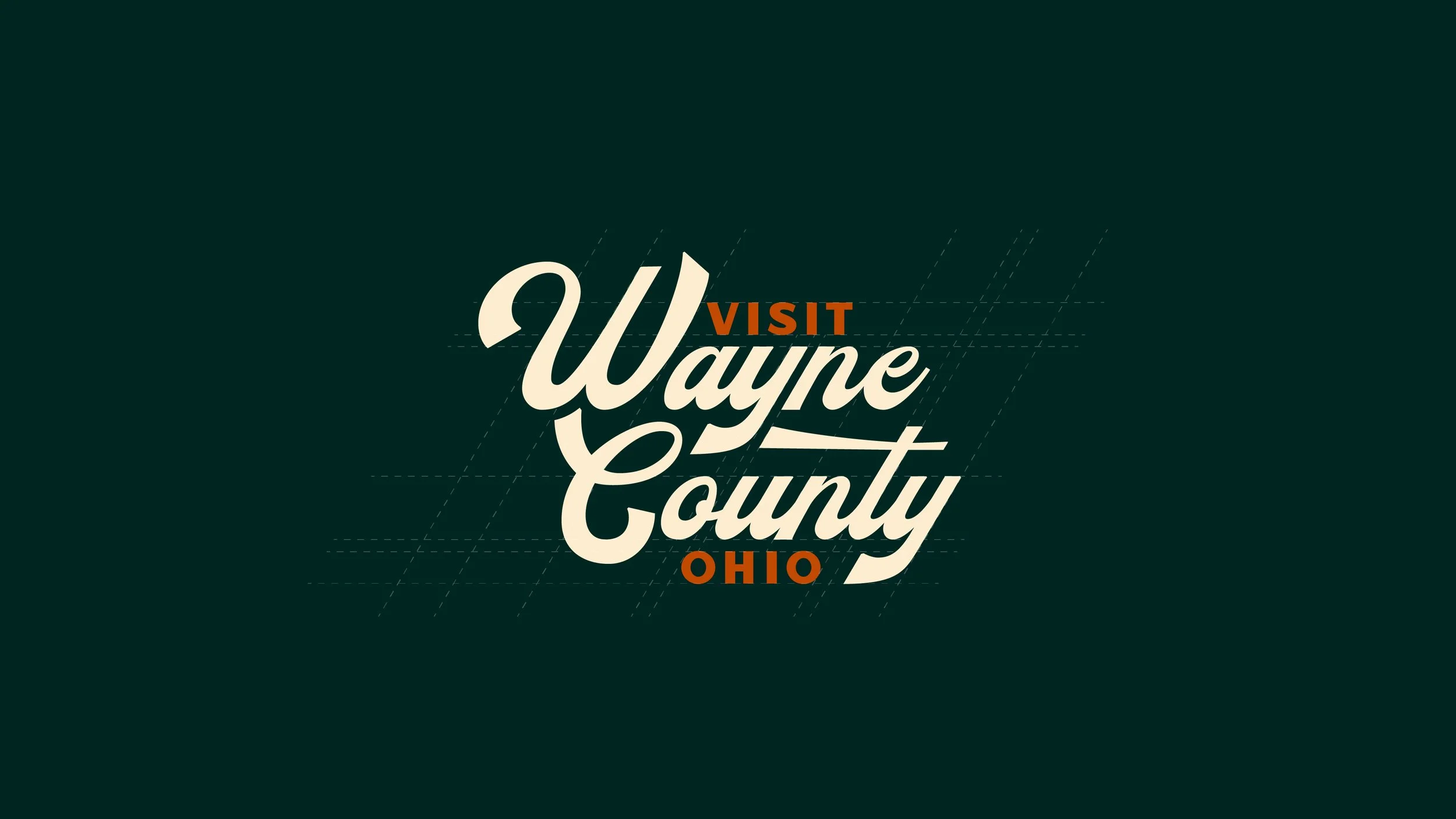
The badge system started with strong custom typography, tweaked to curve and mimic the winding roads and hills of the county. The shapes curved together creating ample opportunities to interlock the letters. This created space to fit in “Visit” and “Ohio” naturally. The color palette was anchored on a rusty orange, a color that I saw reflected throughout the county. I paired it with gold and soft green to round out the bright orange. A rustic feeling cream and dark charcoal green were the final missing pieces of the color palette, making it feel like it belonged in the country but was modern at the same time.
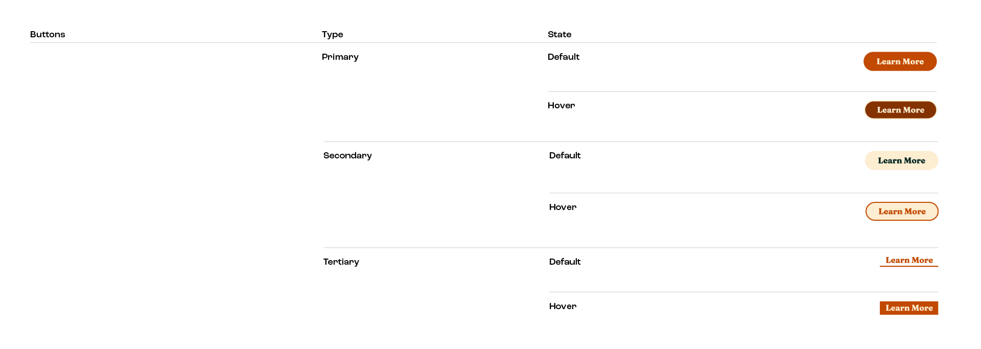
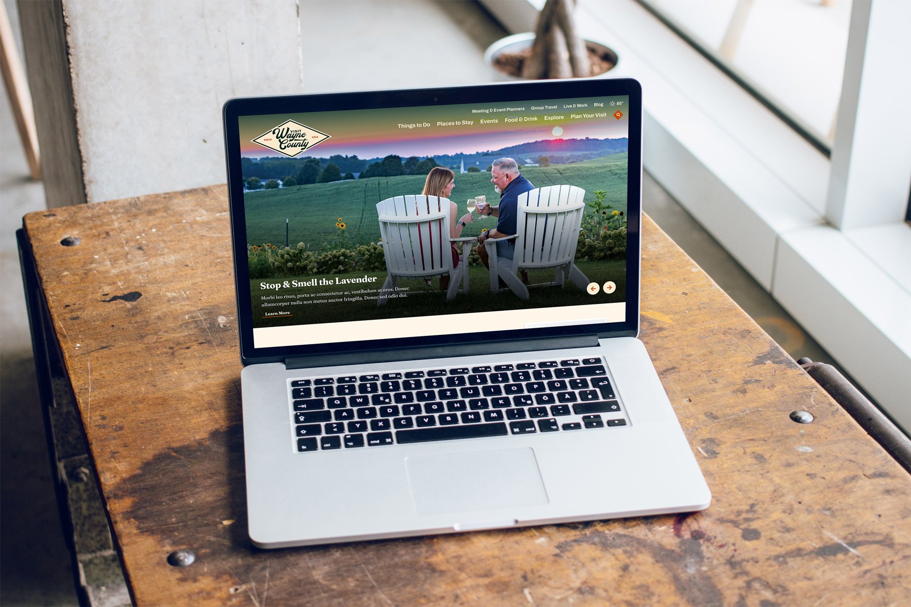
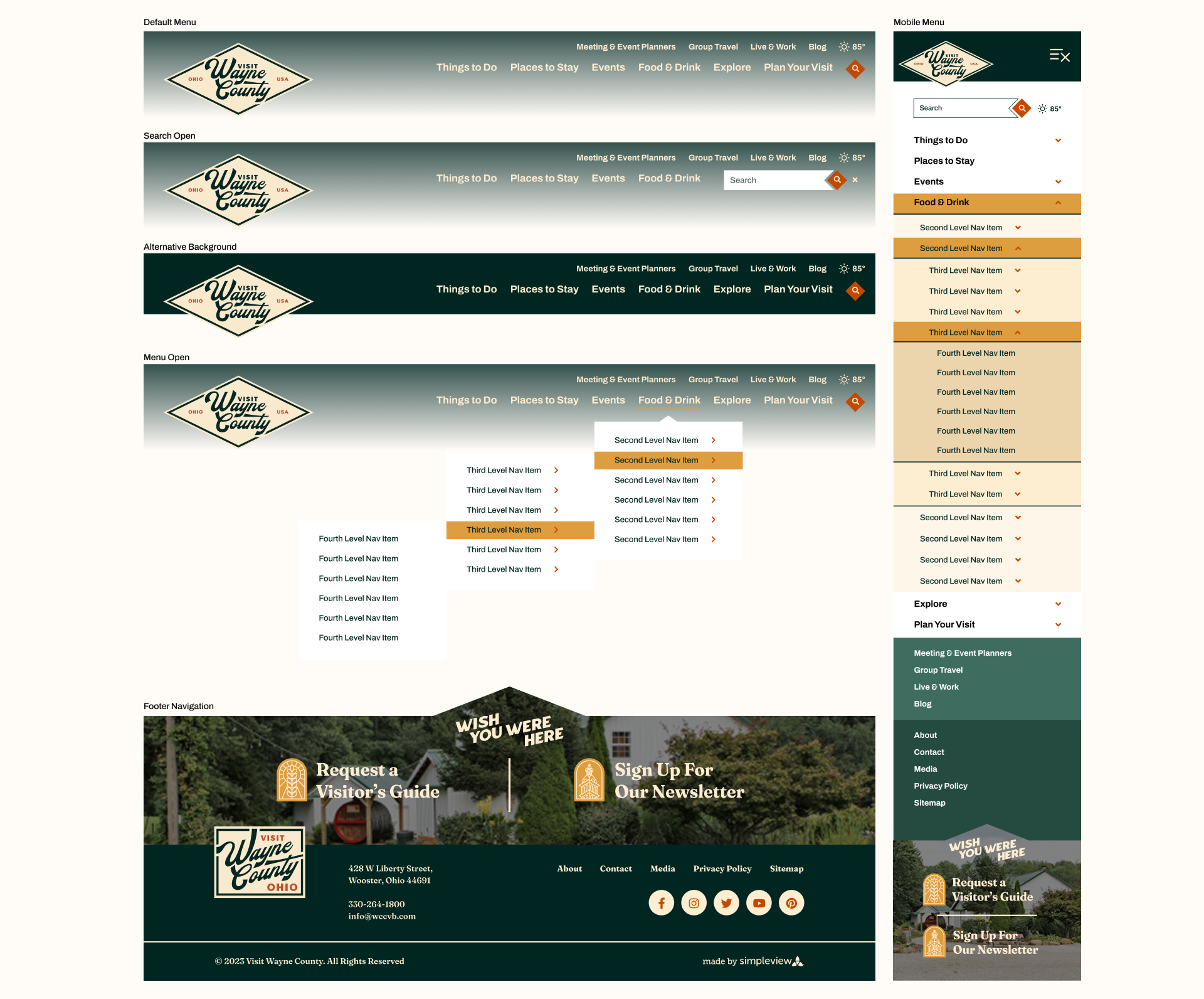
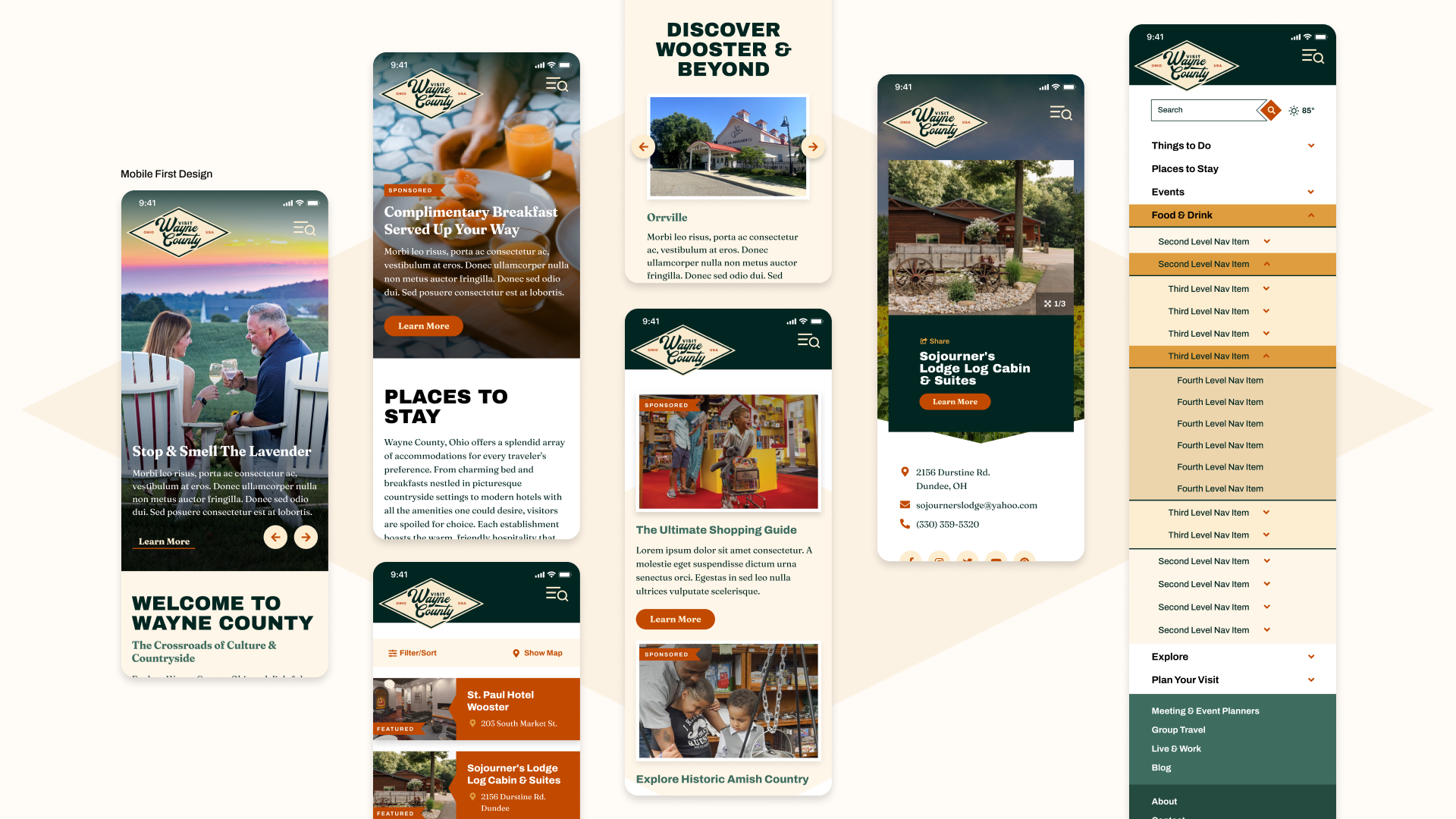
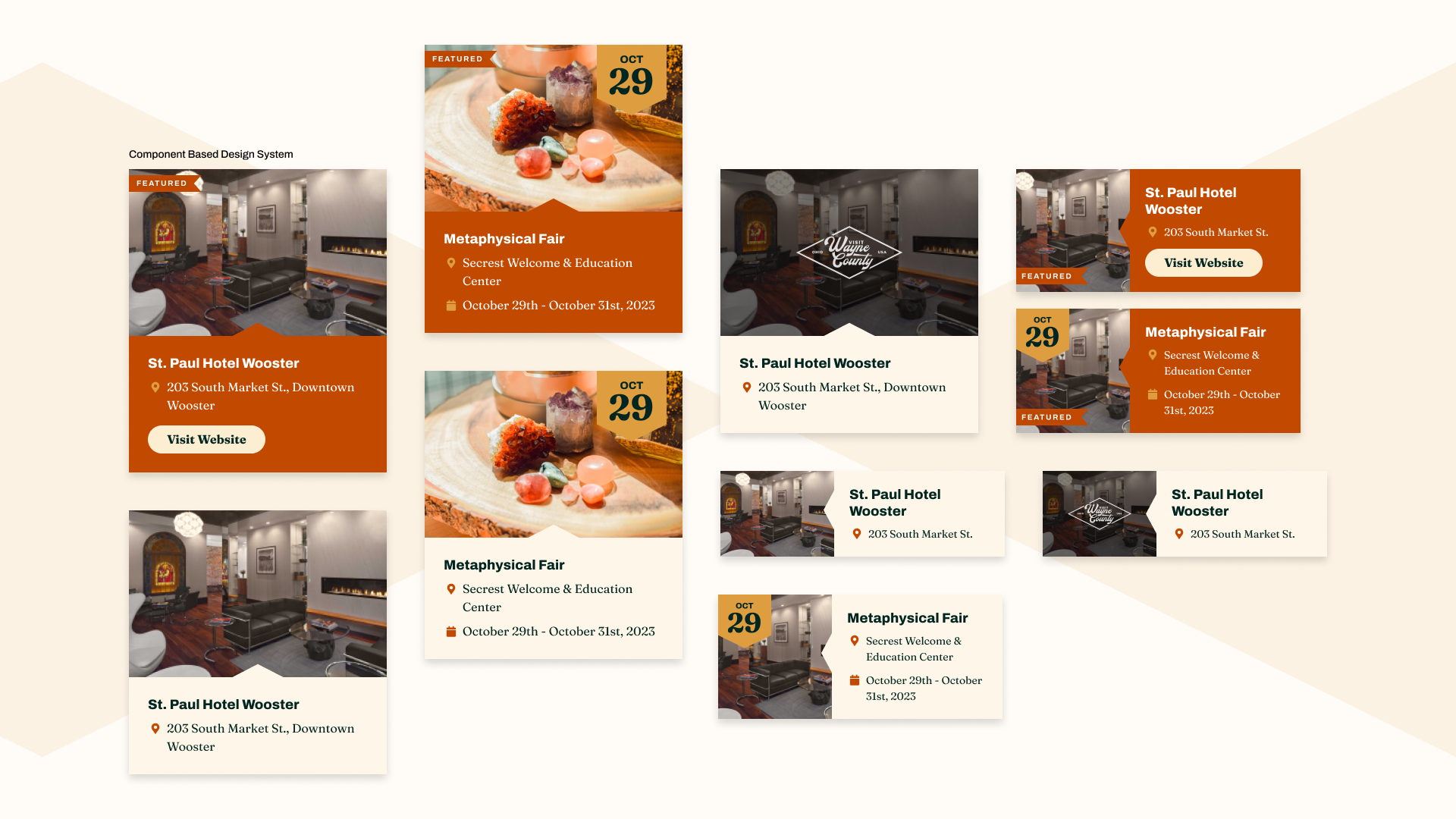
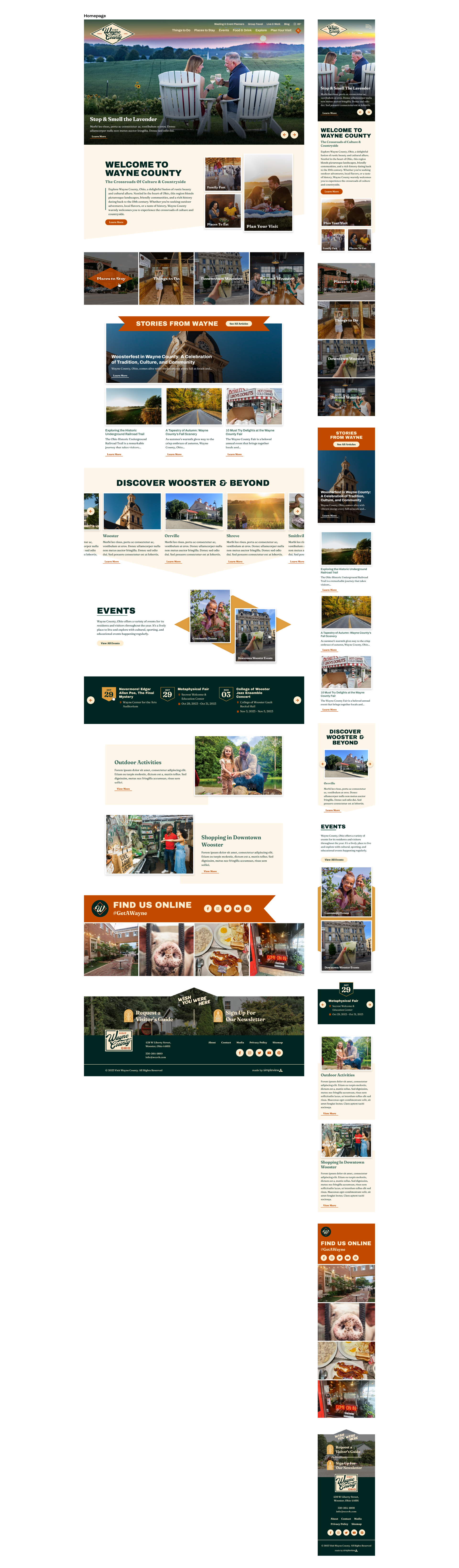
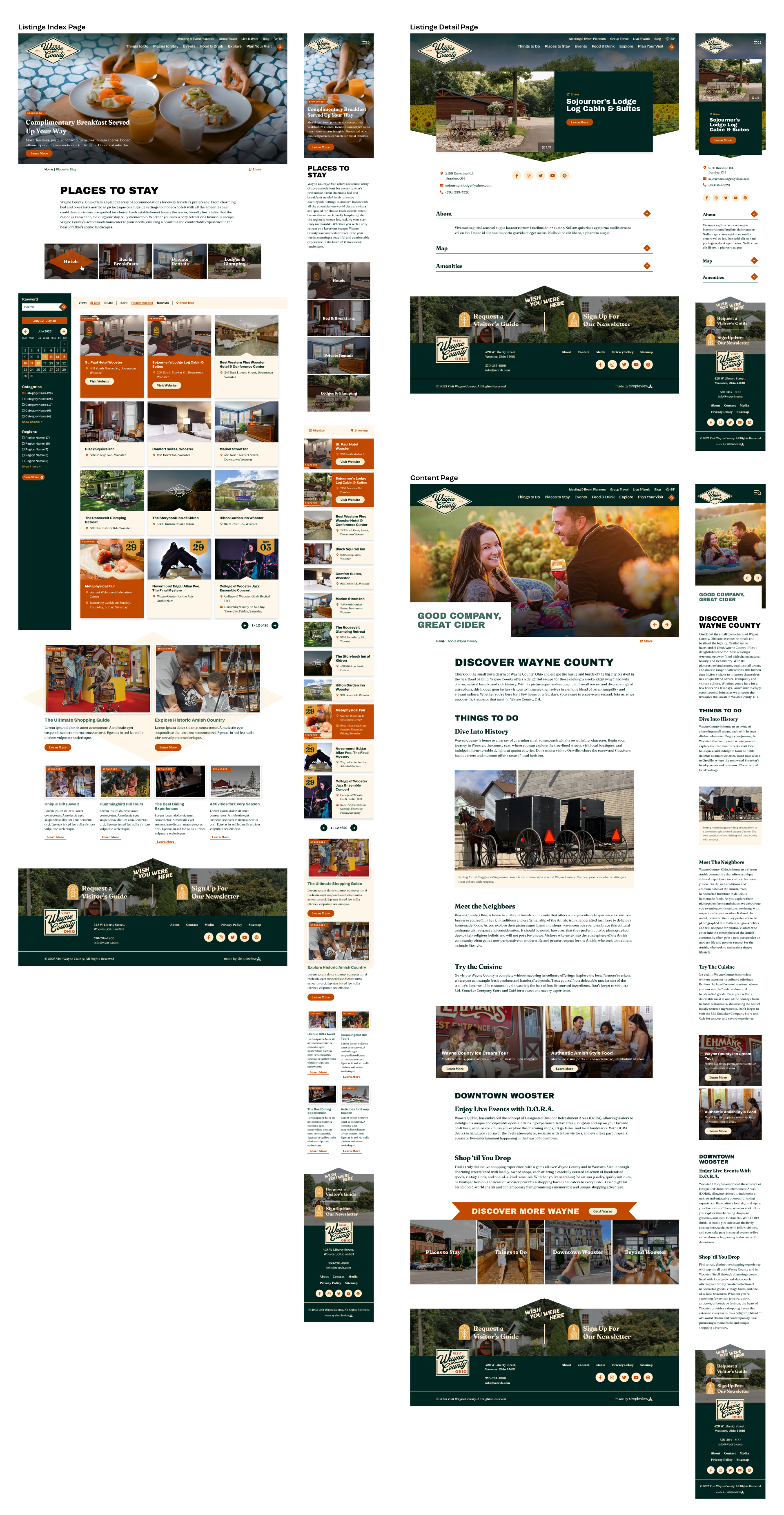
From the main logo, I built out a suite of regional logos celebrating the smaller communities within the county, then carried the identity into a responsive website designed around the county's real priorities: driving Visitors Guide requests, surfacing blog content, and pointing both visitors and residents toward the events calendar.
Regional & Competitor Analysis
Wayne County had a unique challenge of not being the sole Wayne County in the US. So in addition to doing a regional competitive analysis with nearby counties, I did a competitive analysis with counties with the same name.


Insights
Light & Bright, Wayne County’s logo is bogged down by complexities. It needs space to breathe, with lots of white space between colors
Interesting Typography, not many of the regional or competitive examples use unique typefaces, they mostly use a lot of san serif fonts
CTA in name, Explore, Visit, etc.
A unique color palette that stays away from blue as the primary color