Ray Ray's Sonoran Spirit Tea
Hard Tea Branding and Packaging for good friends, good spirits, and good friends in good spirits.
Role
Brand Identity • Packaging Design
Scope
Brand Strategy • Visual Identity • Graphic System • Packaging
Agency & Year
Freelance | 2022 – Ongoing
Thanks to
Rachel Dacquisto - Owner of Ray Ray’s
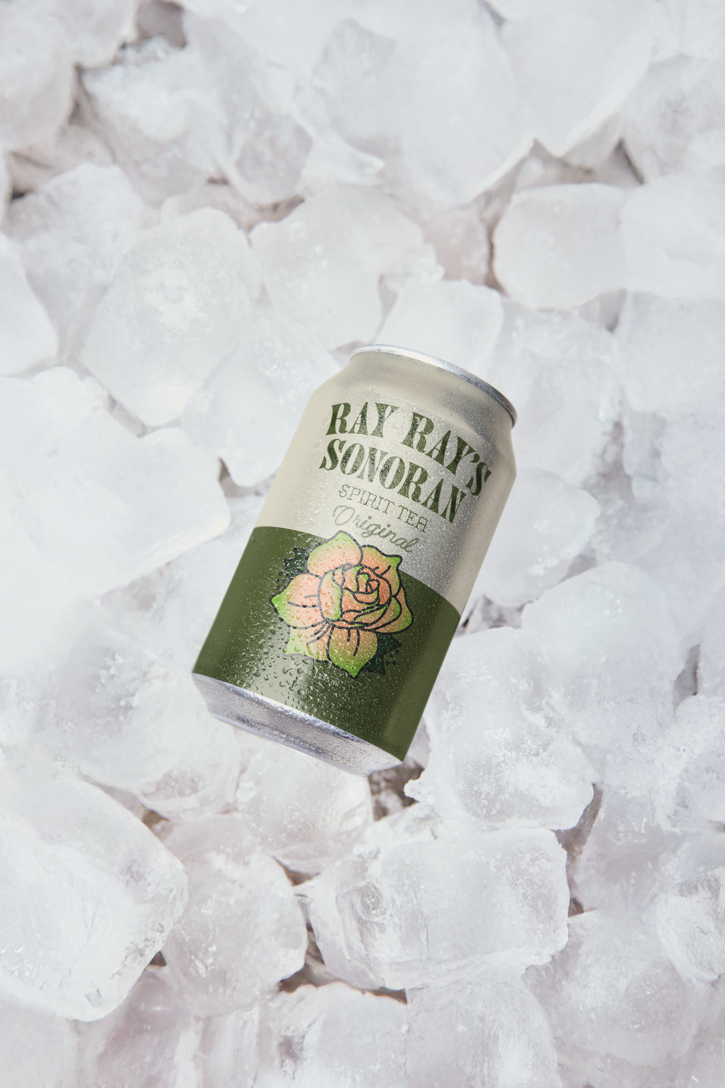
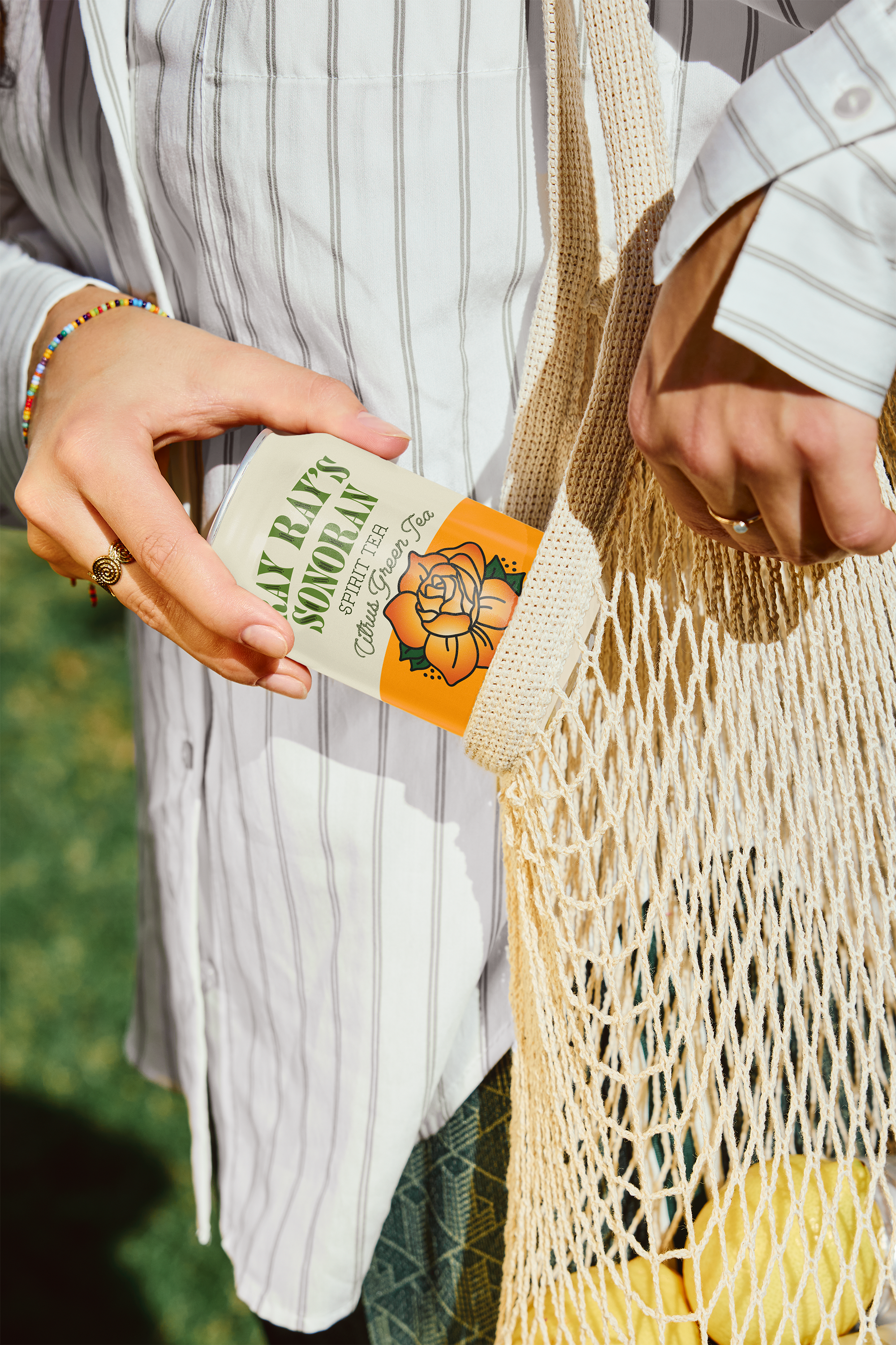
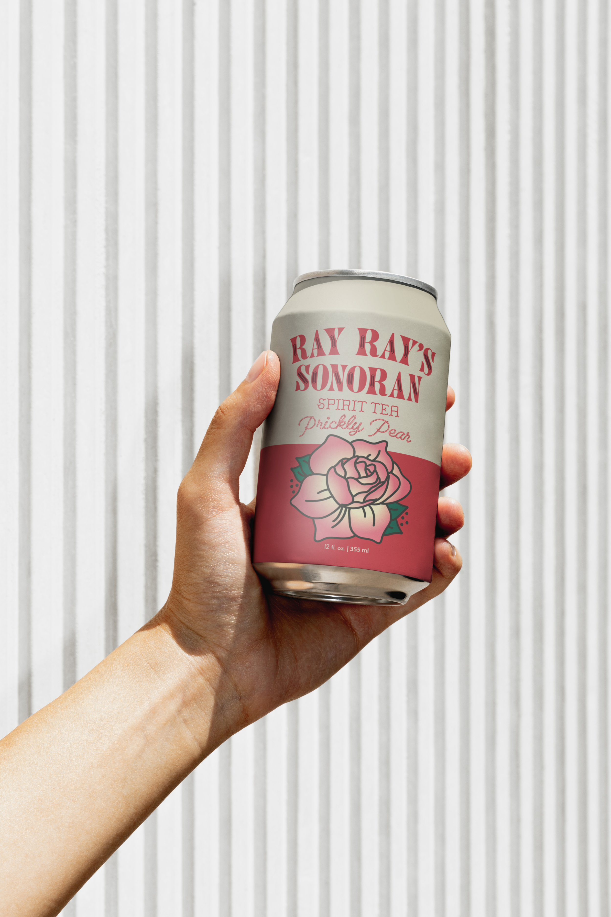
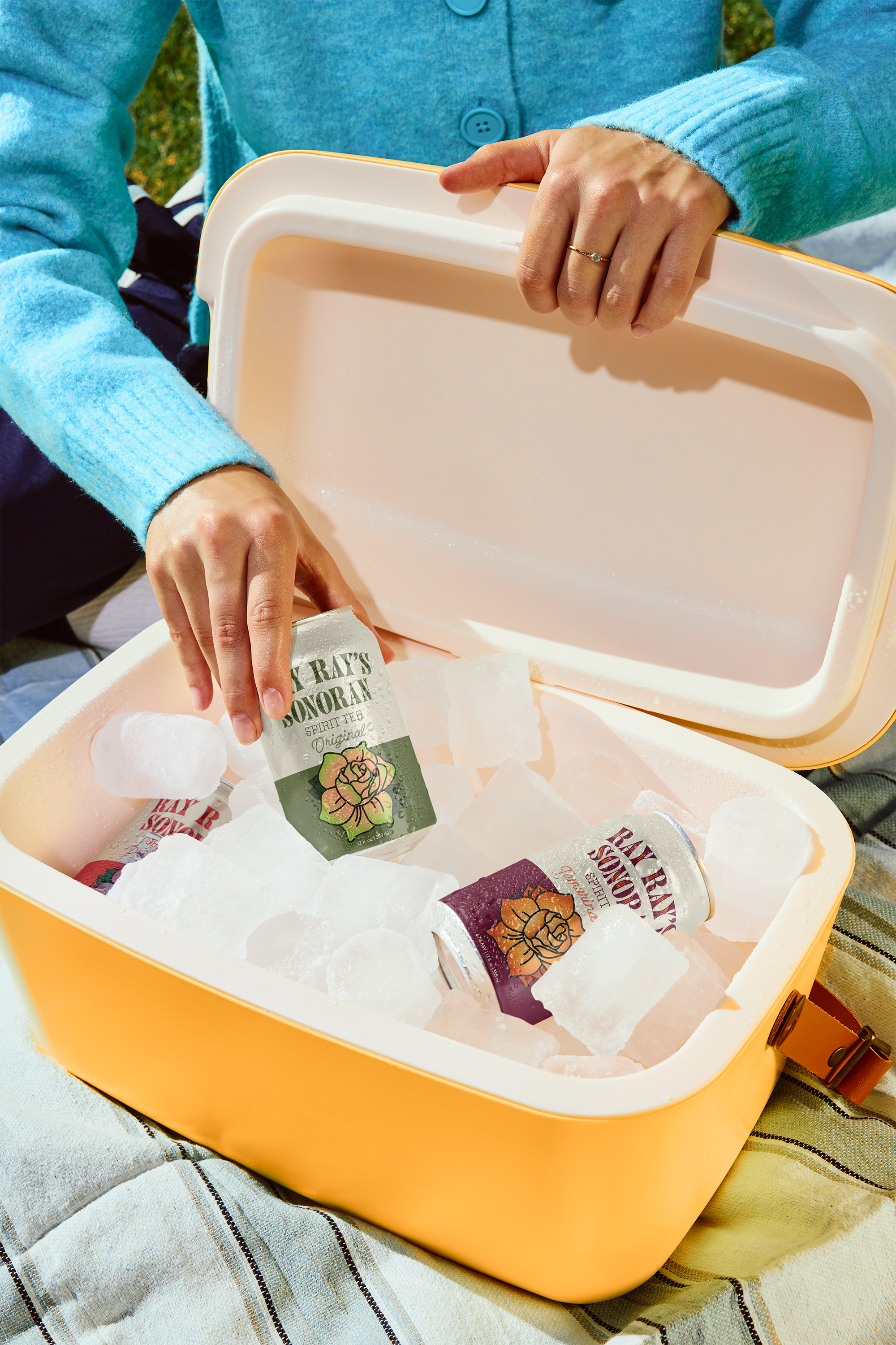
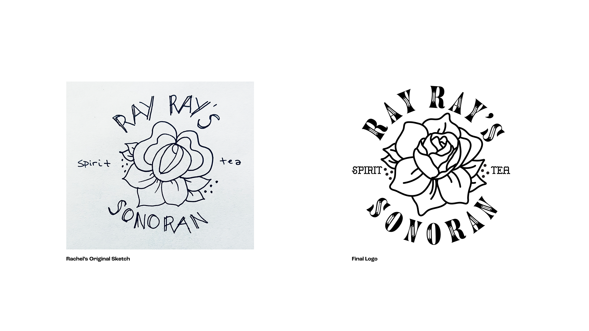
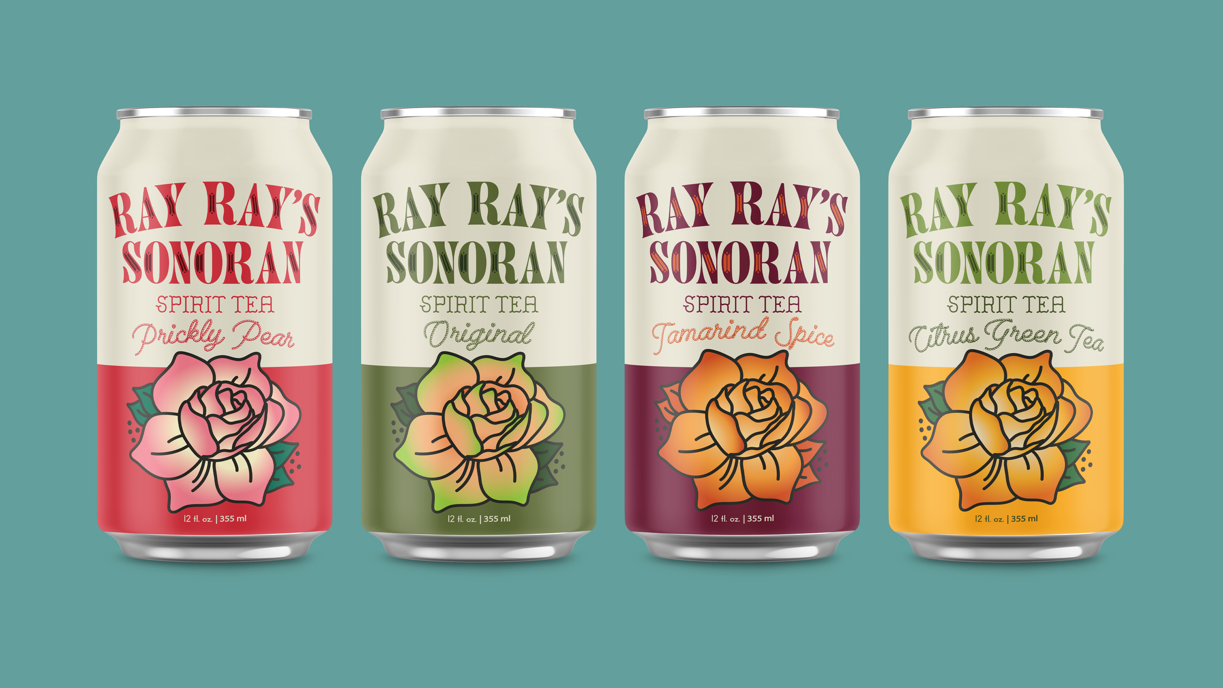
Rachel Dacquisto, a Tucson career bartender, came to me with a drink she already believed in and a flower sketched on paper, the seed for everything that followed. I built the full brand from there: logo, packaging, and illustration system across four flavors, plus the full print and digital suite to launch it. Today Ray Ray's is in bars, restaurants, and shops across the city, with coverage from Tucson Foodie to Visit Tucson.
The Full Story
Before I made any design decisions, I needed to understand who Ray Rays was for. She had a phrase in discovery that said it all: pride of place. Her audience spans Tucson locals, Phoenix transplants, Dusk Festival-goers, and ranchers from Marana. Tucson’s pride has always been about being culturally diverse, community-minded, and fiercely proud. The brand needed to speak to all of these people at once.
From our collaboration, we landed on joyful, natural, refreshing, southwest, and modern as our keywords. All these pointed away from the busy, over-illustrated craft beverage look that was dominating the market in early 2022. Walk into any Tucson bottle shop and the shelf will tell you the story: Twisted Tea, White Claw, and Truly on one side. Elaborate illustrated craft beverages from small breweries on the other. The opportunity was the gap between them, something bold to stand out but simple enough that it felt like it belonged to everyone.
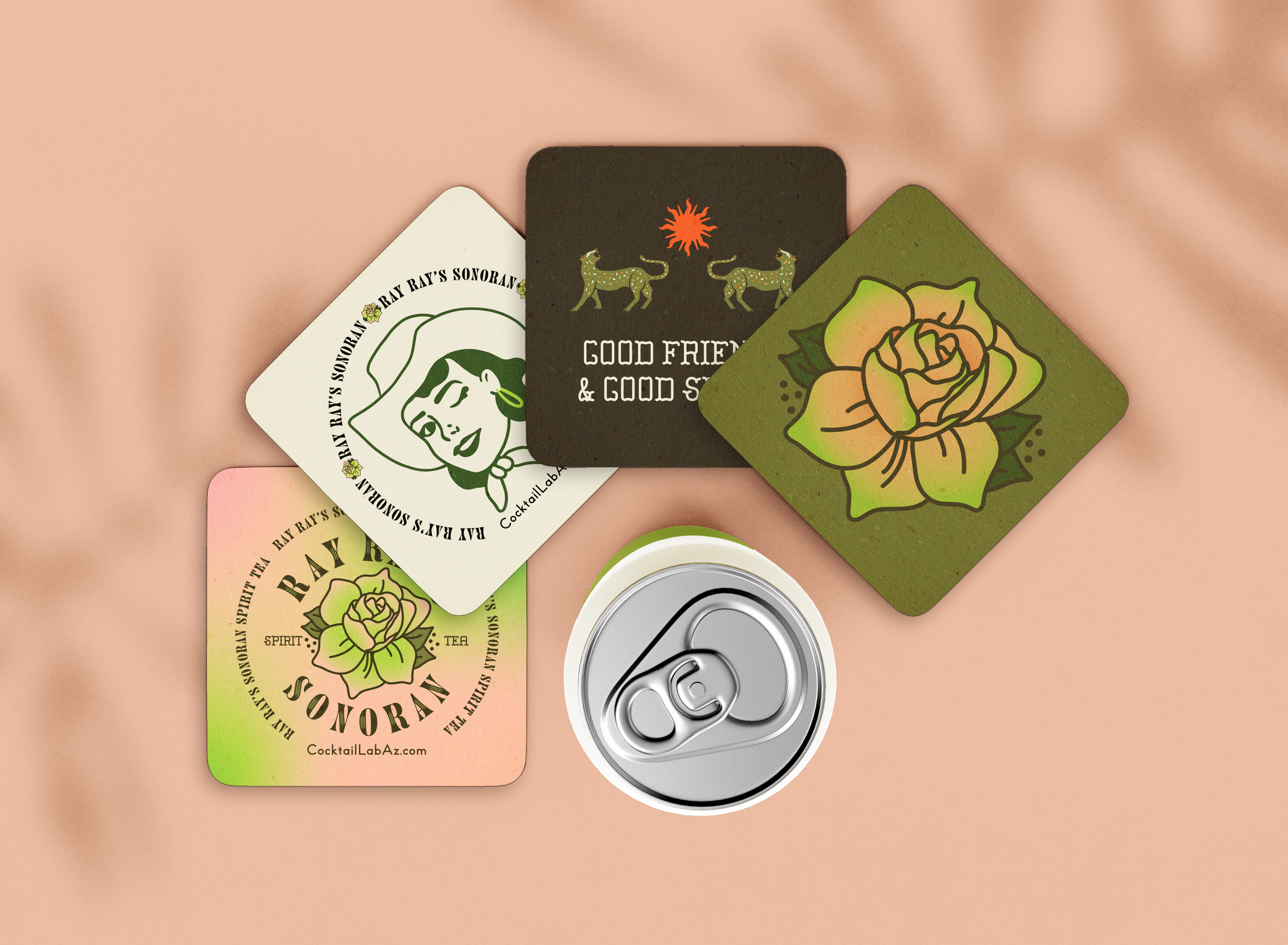
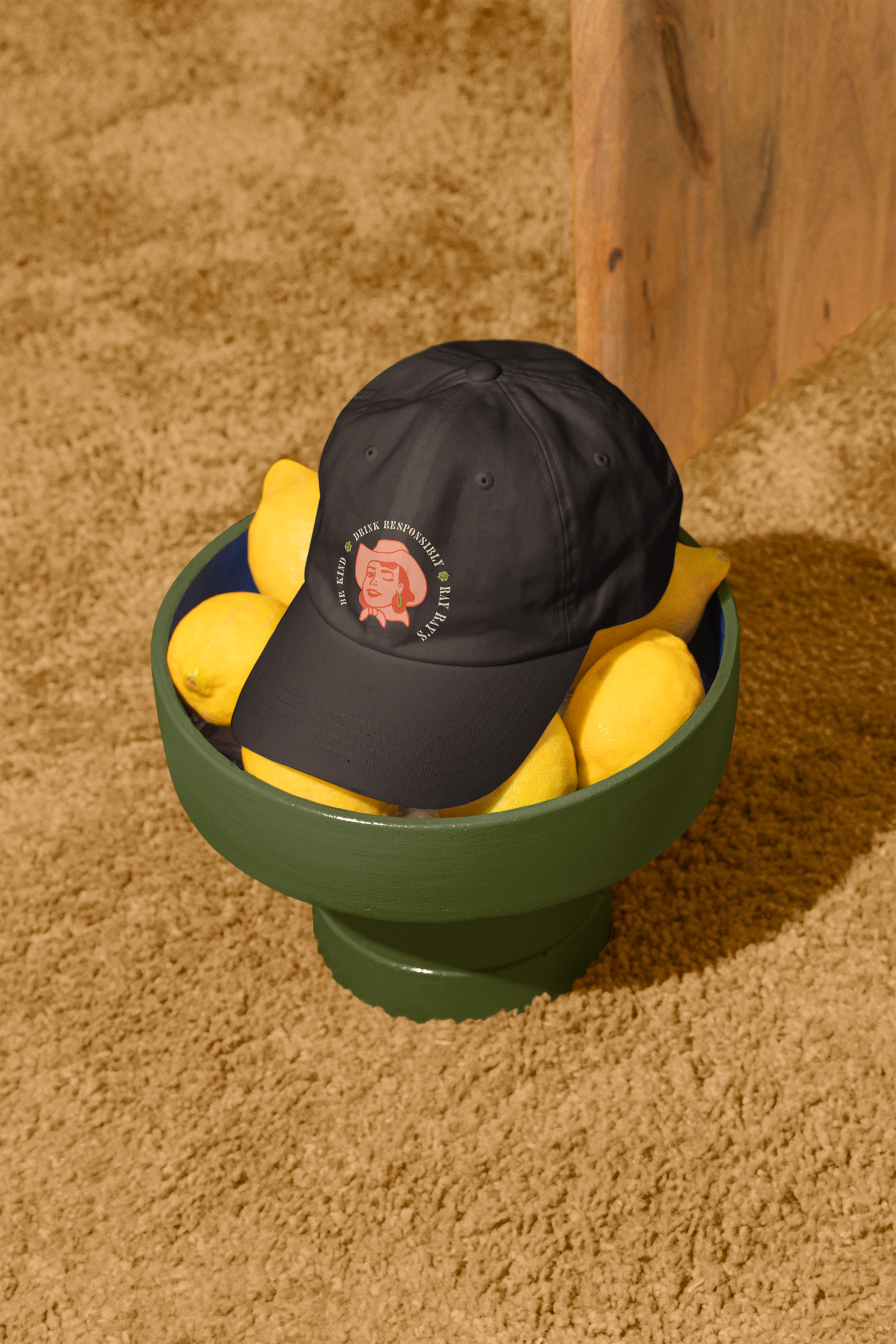
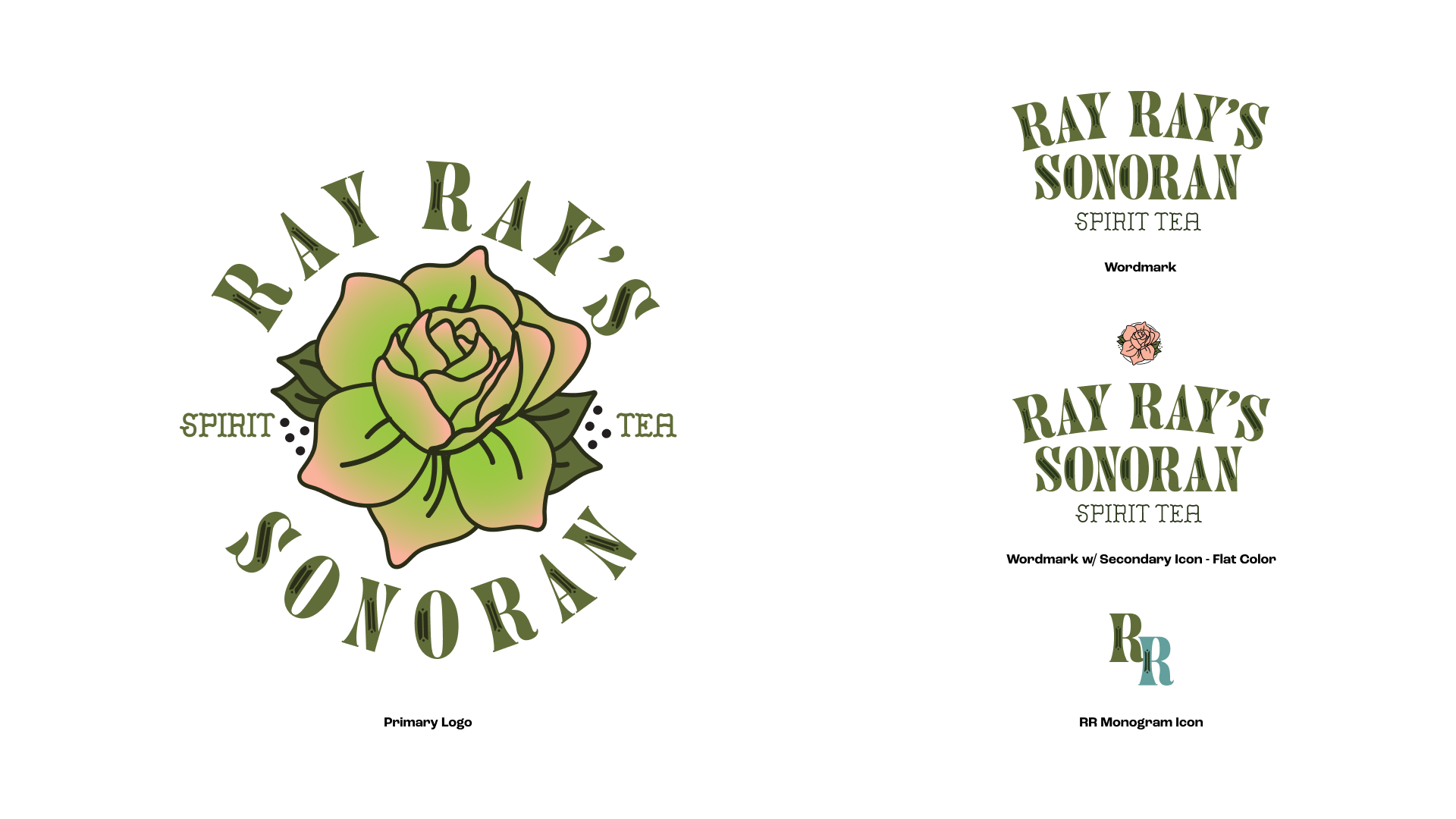
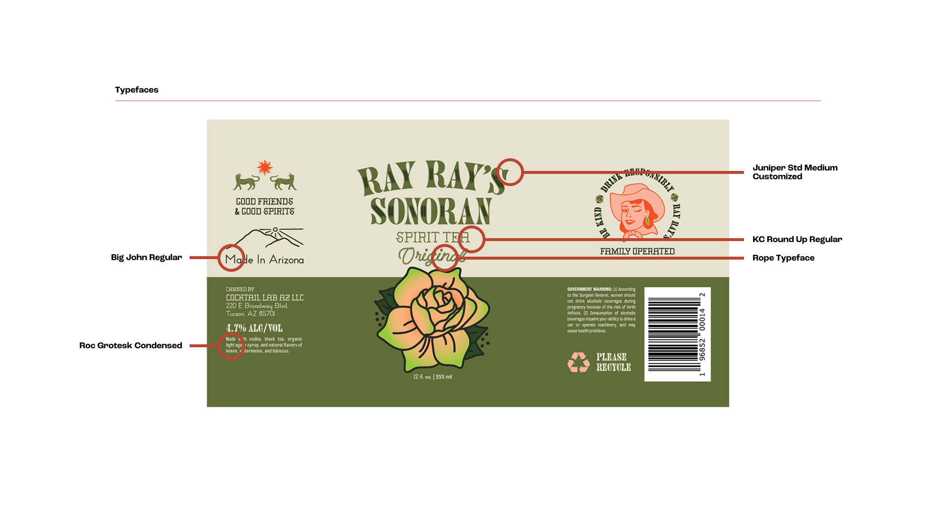
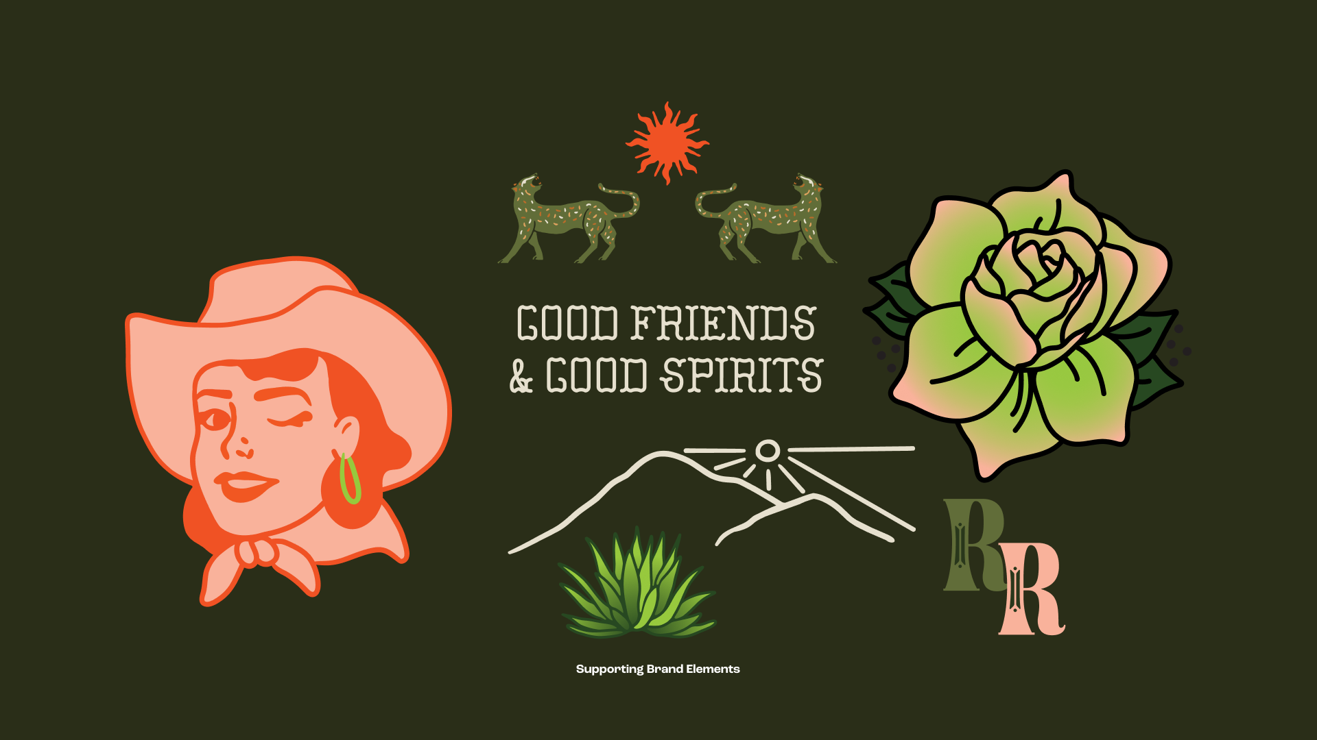
The system started with the flower illustration. Building the badge, I landed on Juniper, a modern slab serif that felt southwestern without being gauche, and customizing it so it was uniquely Ray Rays. Working on the label, simplicity gave room for experimentation. The label features five typefaces, each one with a specific job and reason to be there. Breaking the typical conventions of 1-2 typefaces for one deliverable. Beyond the type, the can carries a full cast of characters, the winking cowgirl as a stand in for Rachel herself is the hero, the mountain, sun, jaguars, and copy. Every element rewards a second glance.
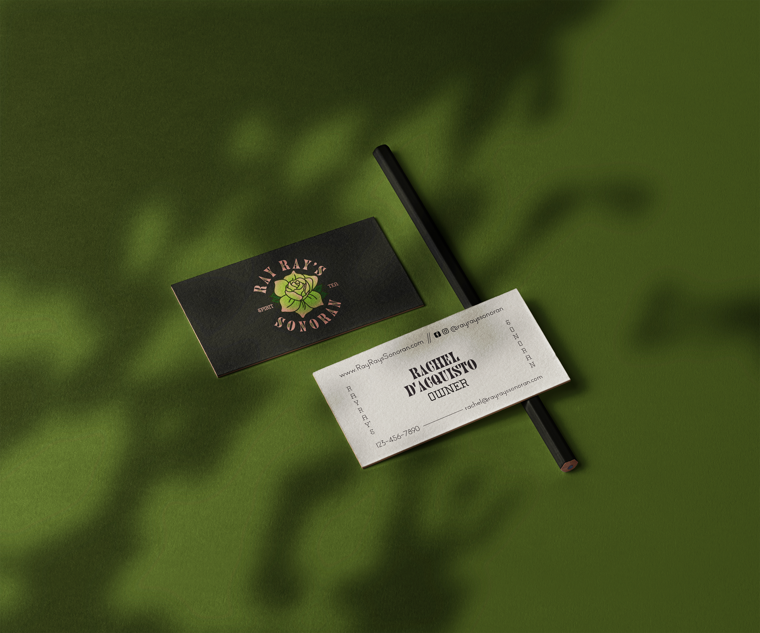
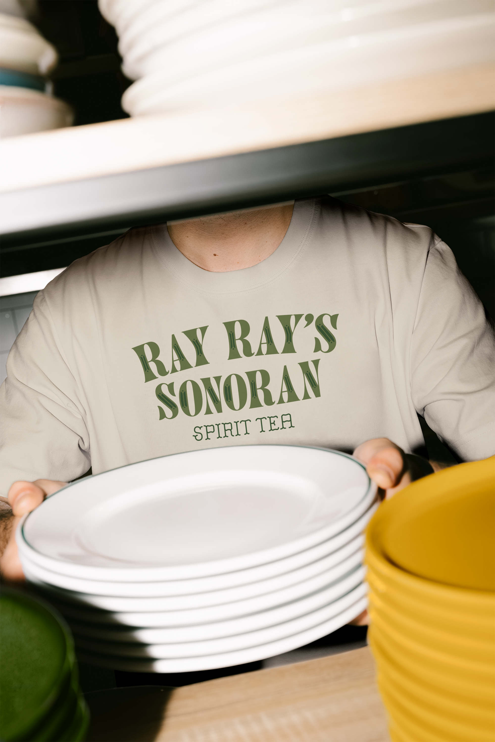
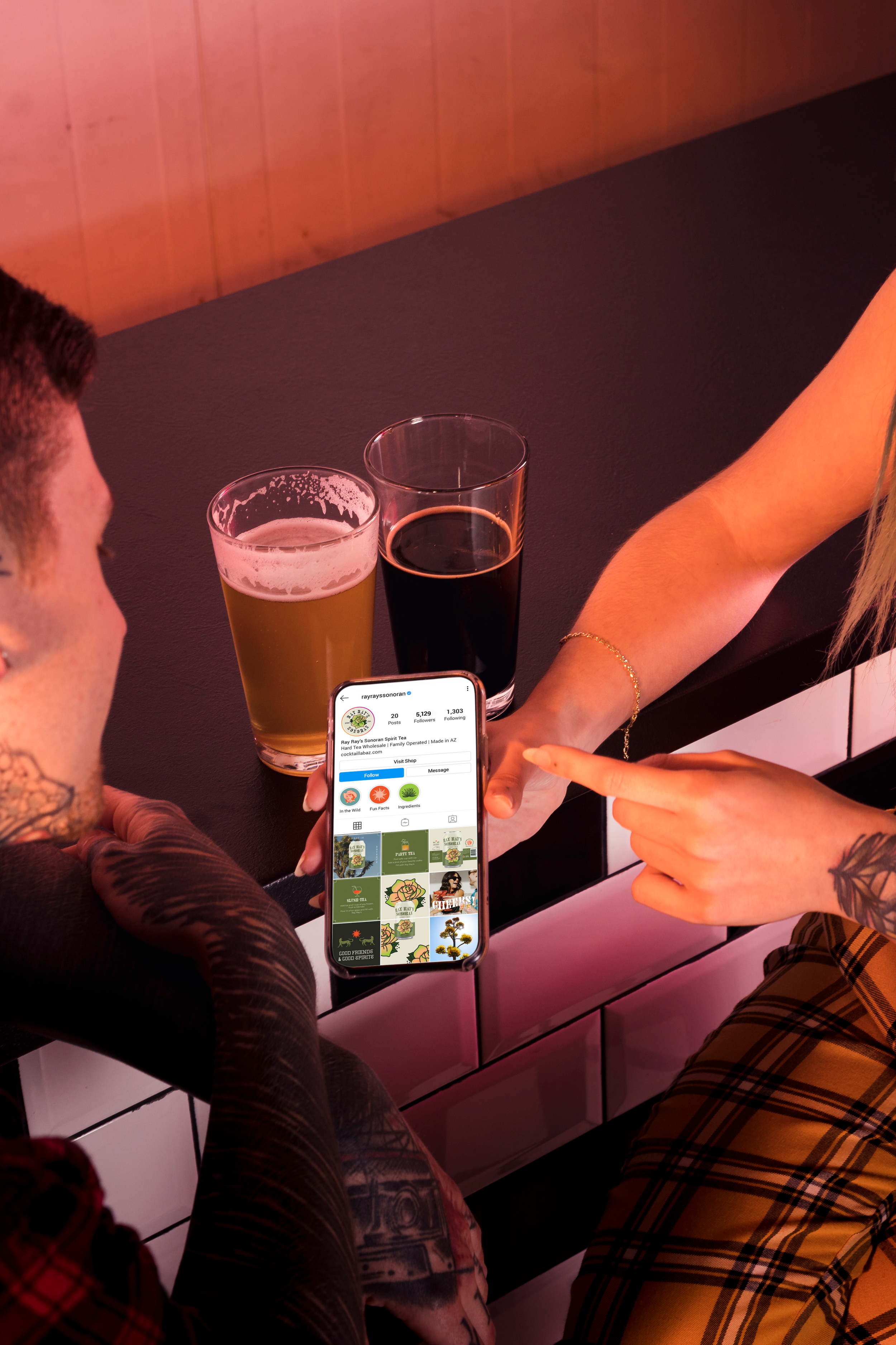
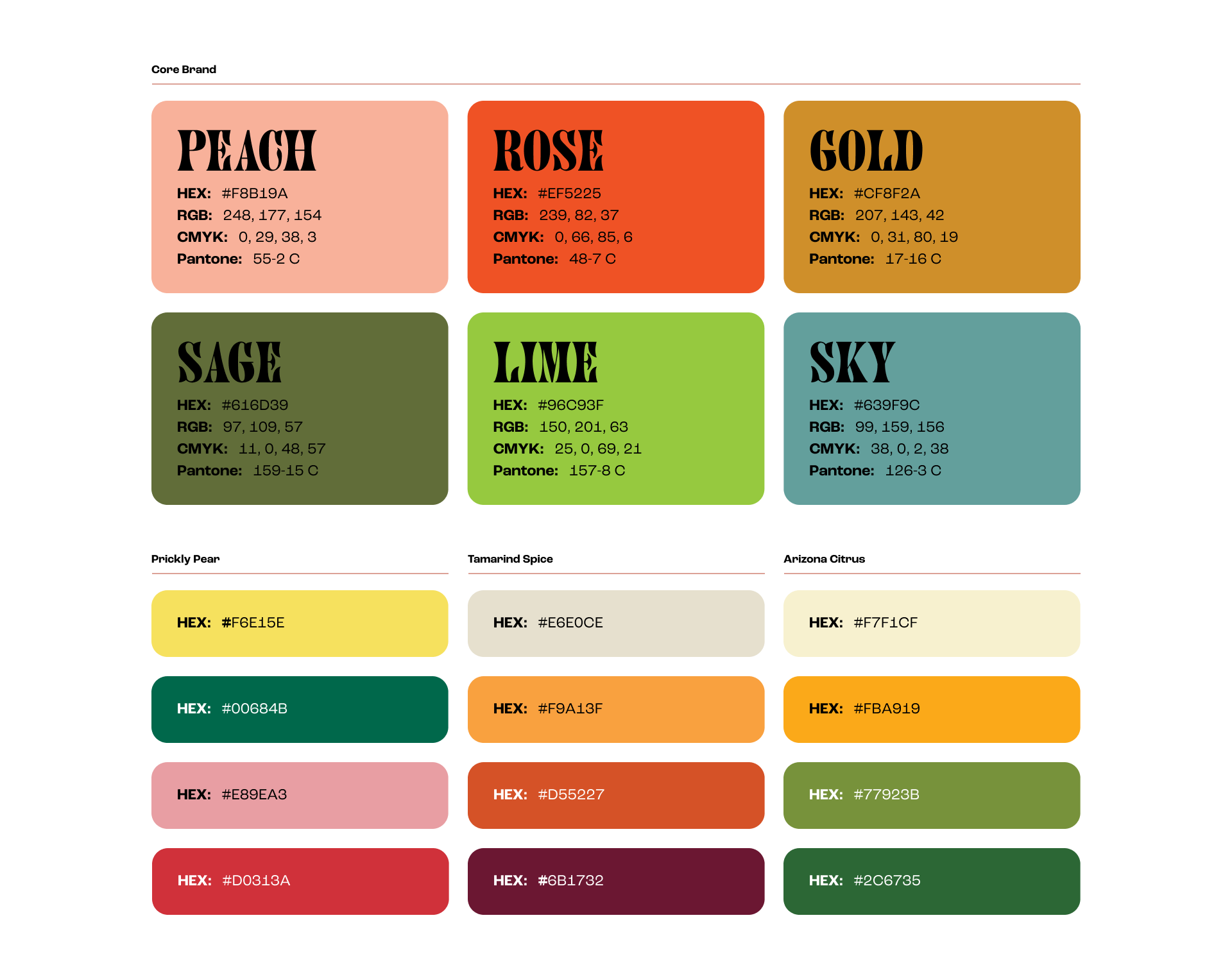
What started as one label for Rachel’s signature flavor turned into a full suite. Beyond the custom labels, a brand system was created as well. Digital and print assets from business cards, keg collars, merchandise, and a full teaser campaign that built anticipation before launch.
Ray Ray's is now in restaurants, bars, and shops all over the city. Rachel and Ray Ray's have been featured in Catalina Foothills Lifestyle Magazine, Shoutout Arizona, Good Food AZ, Visit Tucson, and Tucson Foodie.

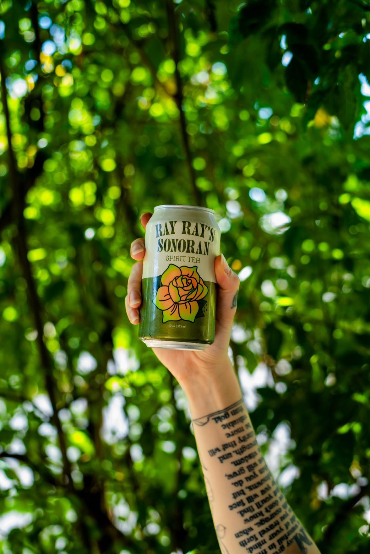
Photography Credit goes to Ryan Brownell | @ryanintucson