Awestruck Docuseries Branding & Art Direction
Branding at the intersection of human wonder and scientific inquiry.
Role
Visual Identity Design • Art Direction
Scope
Visual Identity • Docuseries Art Direction • Launch Campaign
Agency & Year
Noble Studios | 2025 – 2026
Thanks to
Curtis Birch - Director & Editor
Visit Lake Tahoe - Producer
Dr. Paul Piff & Research Team from UC Irvine - Stars & Researchers
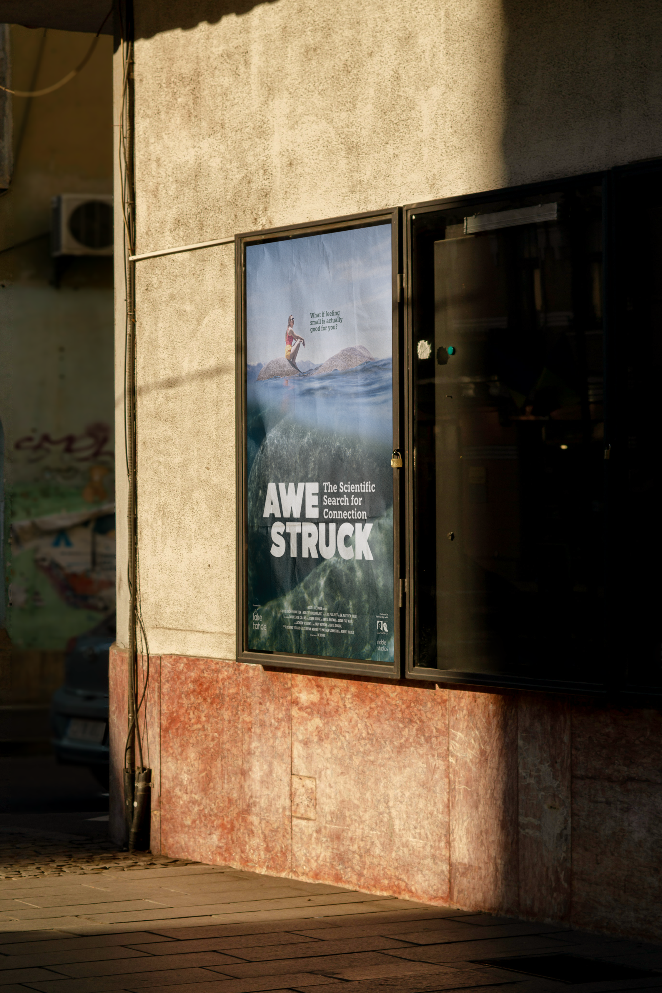
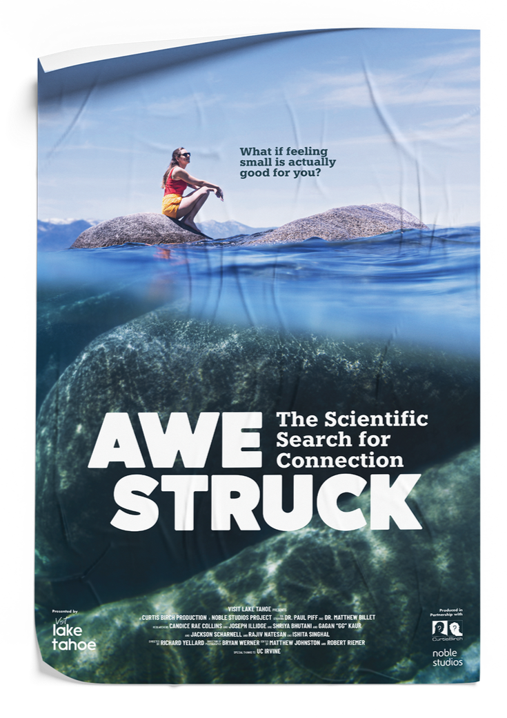
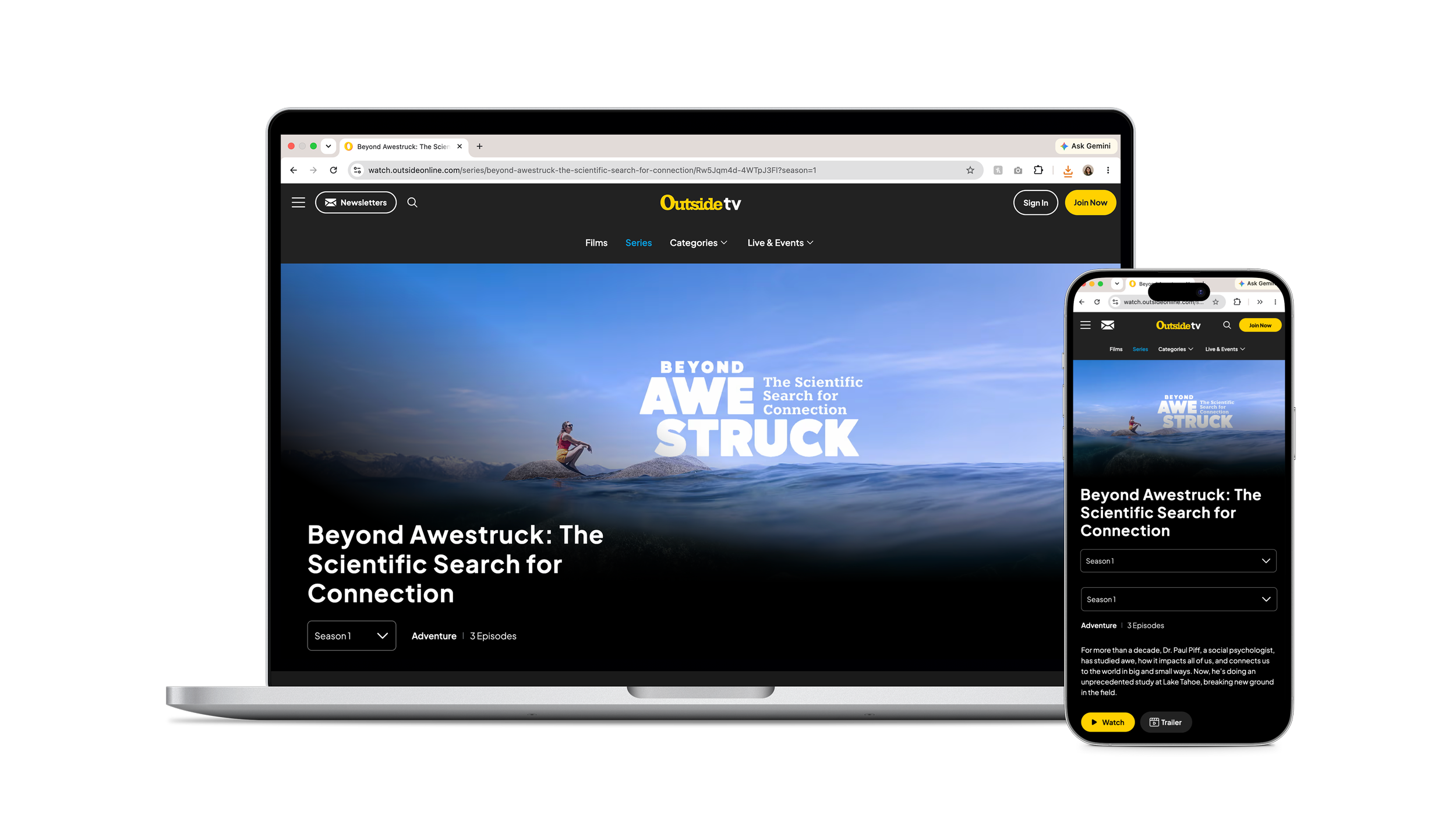
Awestruck follows Dr. Paul Piff and his research team from UC Irvine, in partnership with Visit Lake Tahoe, explore what happens at the intersection of nature and human awe. My job was to give that journey a visual language, something monumental enough to make you feel an ounce of the same kind of smallness that the participants of the case study did when looking at Lake Tahoe. I created a logo system, poster, and an art direction for the docuseries graphics. The series went on to win a Silver Telly Award in Campaign: Travel & Tourism.
The Full Story
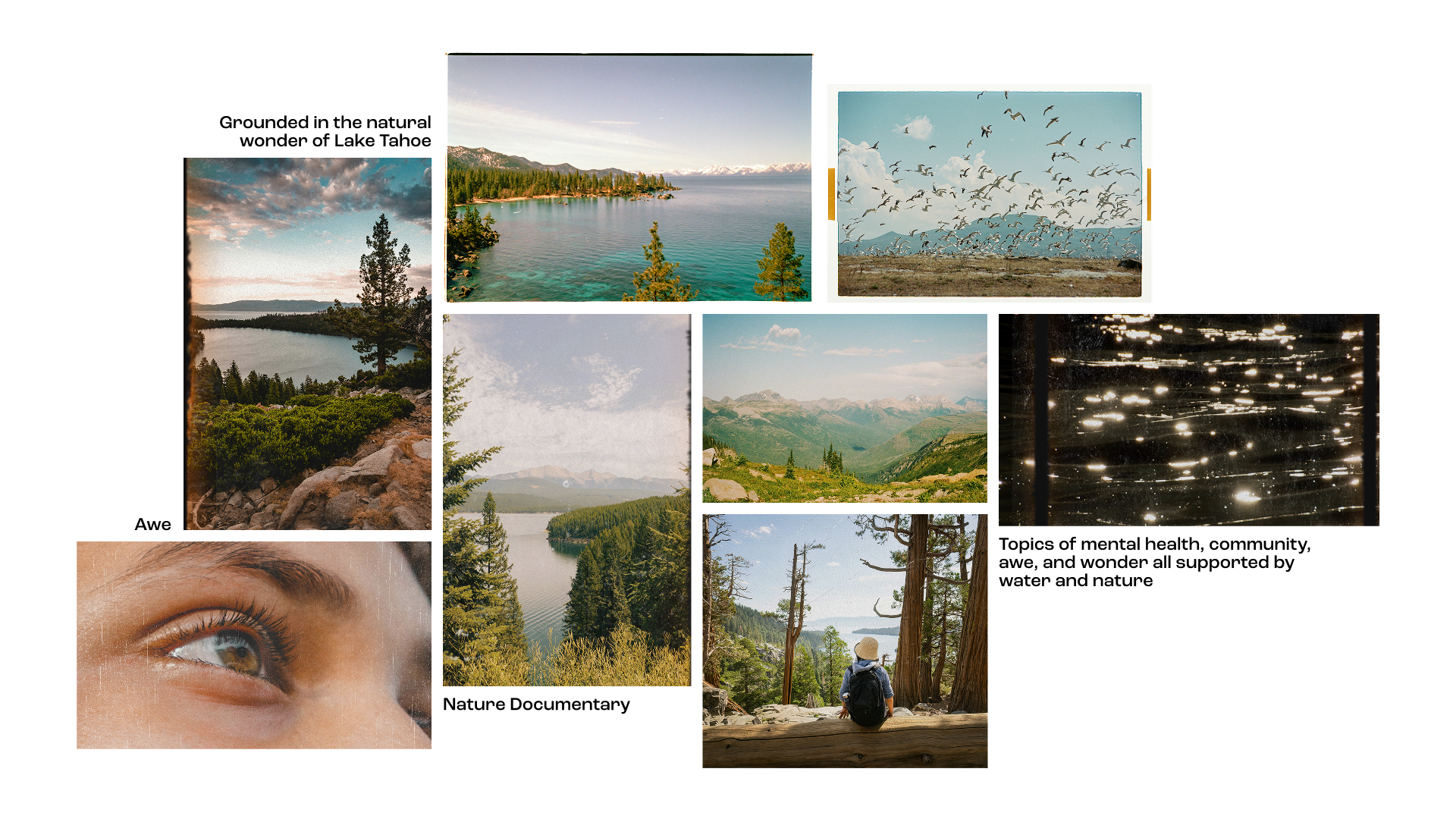
I came onto the project after filming had wrapped, tasking with building the identity and art direction that would help shape the final product. I explored the concept from multiple angles, considering hard science, awe, mental health, and the visual language of prestigious nature documentaries with voiceovers from Sir David Attenborough. The one throughline of the project came down to scale.
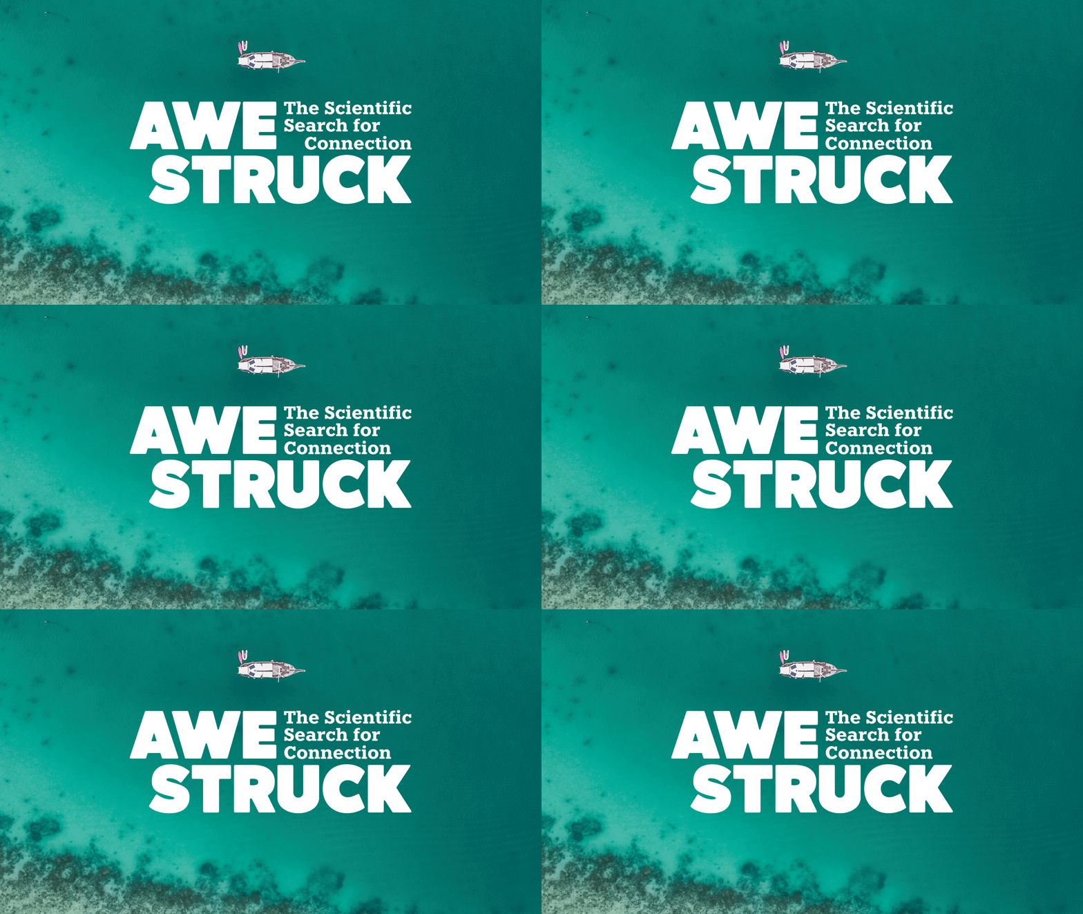
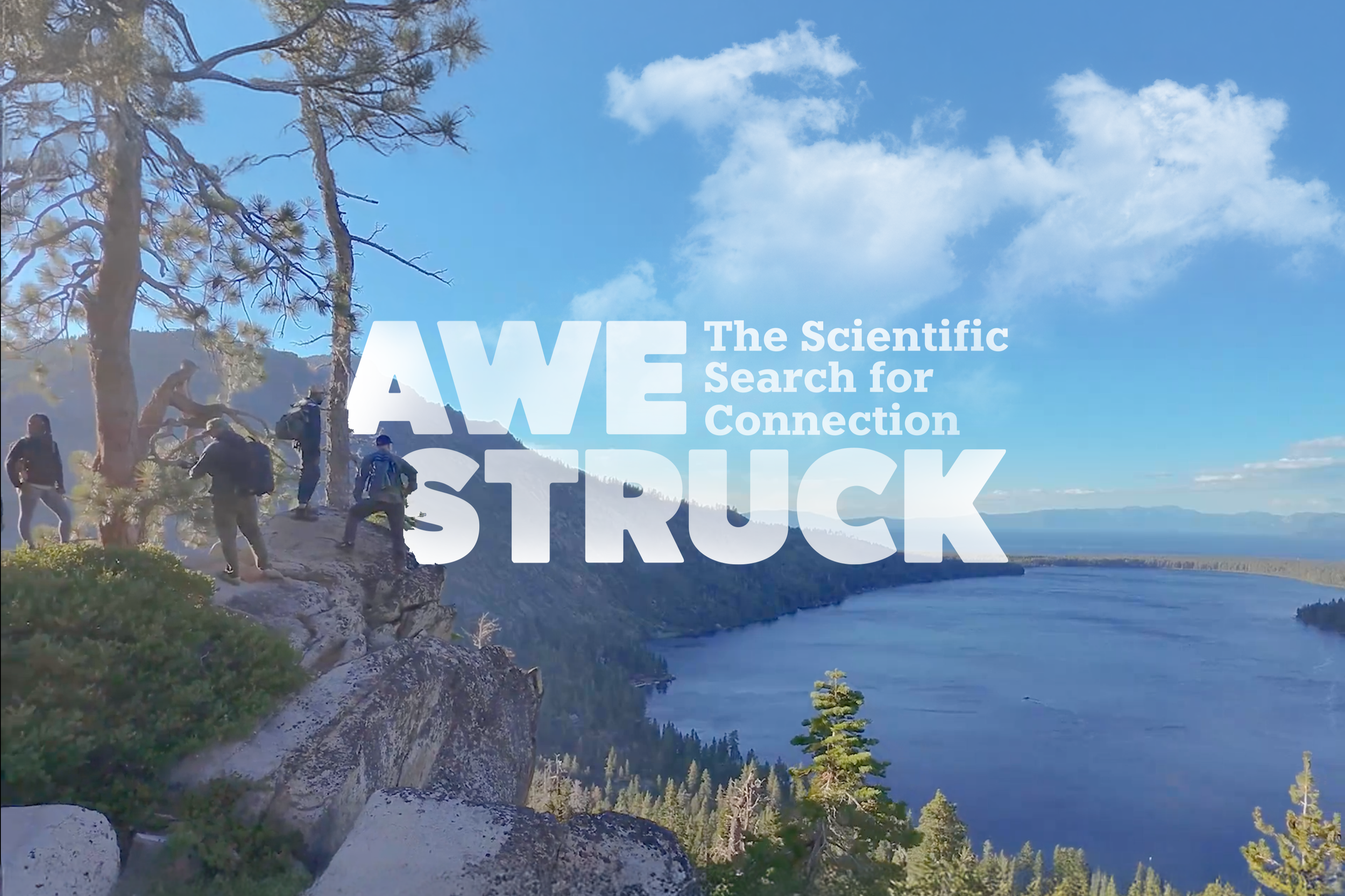
The logo became one of the clearest expressions of scale. When the title landed on Awestruck, I staggered it across two lines instead of compressing it into one, keeping the type large while opening up space for the subheader "The Scientific Search for Connection”. The typeface Atelia felt modern but not cold. Scientific but educational. Inviting and accessible. This seemed to fit the entire narrative arc of the docuseries, centering around human connection, community, and a general sense of being down to earth.
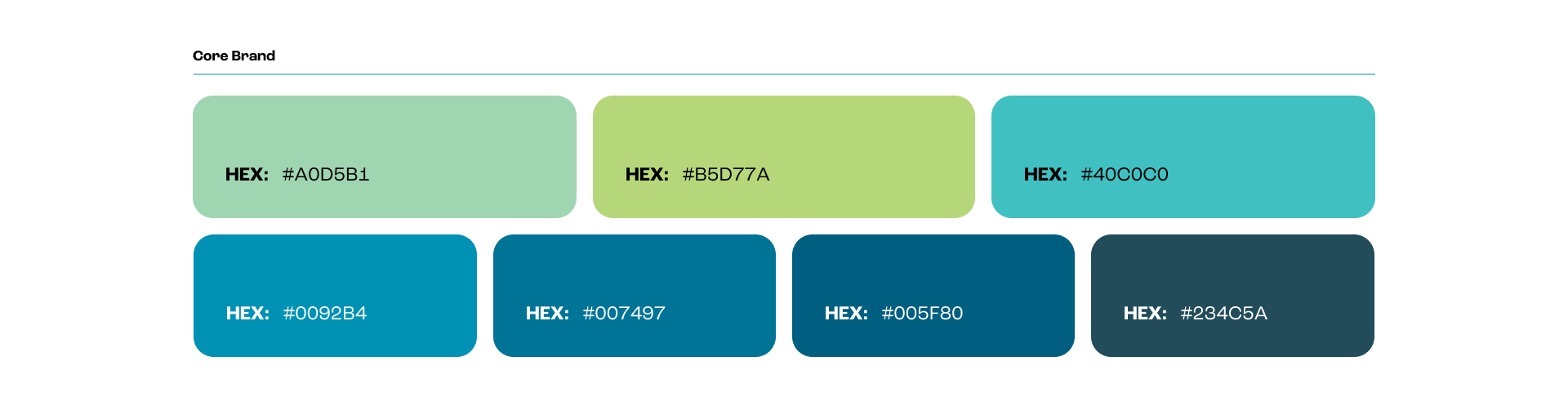
The color palette was pulled from Visit Lake Tahoe’s existing brand, creating a subtle connection to their brand but still allowing the docuseries to exist as its own entity. The range of light teals and greens to dark blues allowed for flexibility when designing. Beyond the core identity, I built moodboards and art direction guides for the editing team, so the finished episodes carried the same visual DNA as the branding.