Delice Food Capitals Non-Profit Visual Identity
A Global Brand Identity Rooted in Culinary Connections
Délice Food Capitals is an international member based network celebrating culinary excellence and encouraging food industry economic development in cities around the globe.
The visual identity aimed to create a cohesive and visually compelling brand that reflects the vibrancy and diversity of the network's member cities. The identity combines bold typography, modern design elements, and a palette inspired by global cuisine to communicate Délice’s mission of fostering connections through food, culture, and shared values.
Agency
Simpleview
Thanks to
Eva Orduño - Art Direction
Role
Visual Identity Design & Mockup Conception
Scope
Visual Identity
Project Goals
The design must be readable and adaptive, ensuring flexibility across digital and print applications.
It should represent a broad & diverse cultural heritages, honoring the global nature of food and community.
Harmony, taste, and pleasure should be at the centerfold of the visual identity, capturing the emotional and sensory richness of gastronomy.
It must be aspirational and immediately clear, appealing to global audiences while communicating meaning at a glance.
Discovery & Research Insights
Learning, sharing, and connecting are core themes, reinforcing food’s role in building relationships and spreading knowledge.
The brand should feel professional yet warm, elevating the mission with credibility while still maintaining the humility, care, and passion, which is at the core of the organization.
Cultural heritage, sustainability, and social cohesion are essential values, pointing to food’s impact on both people and place.


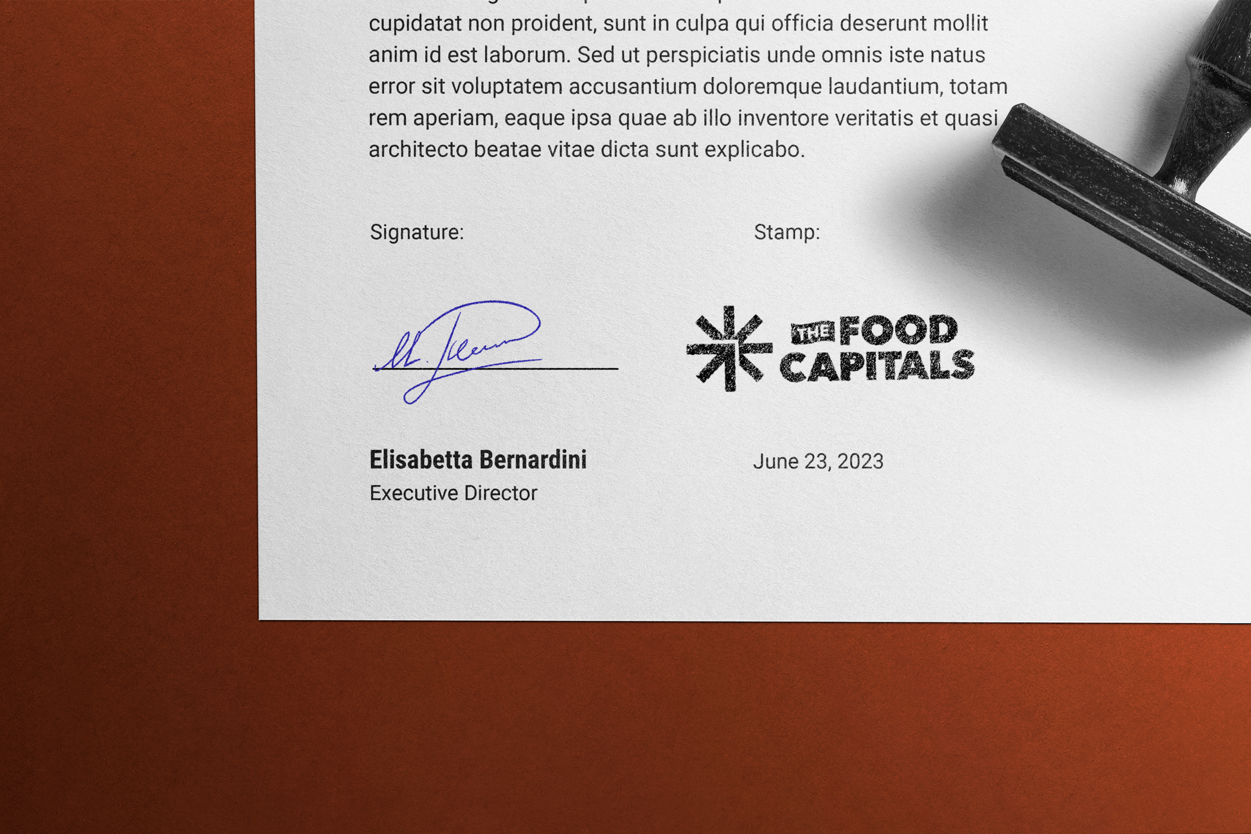
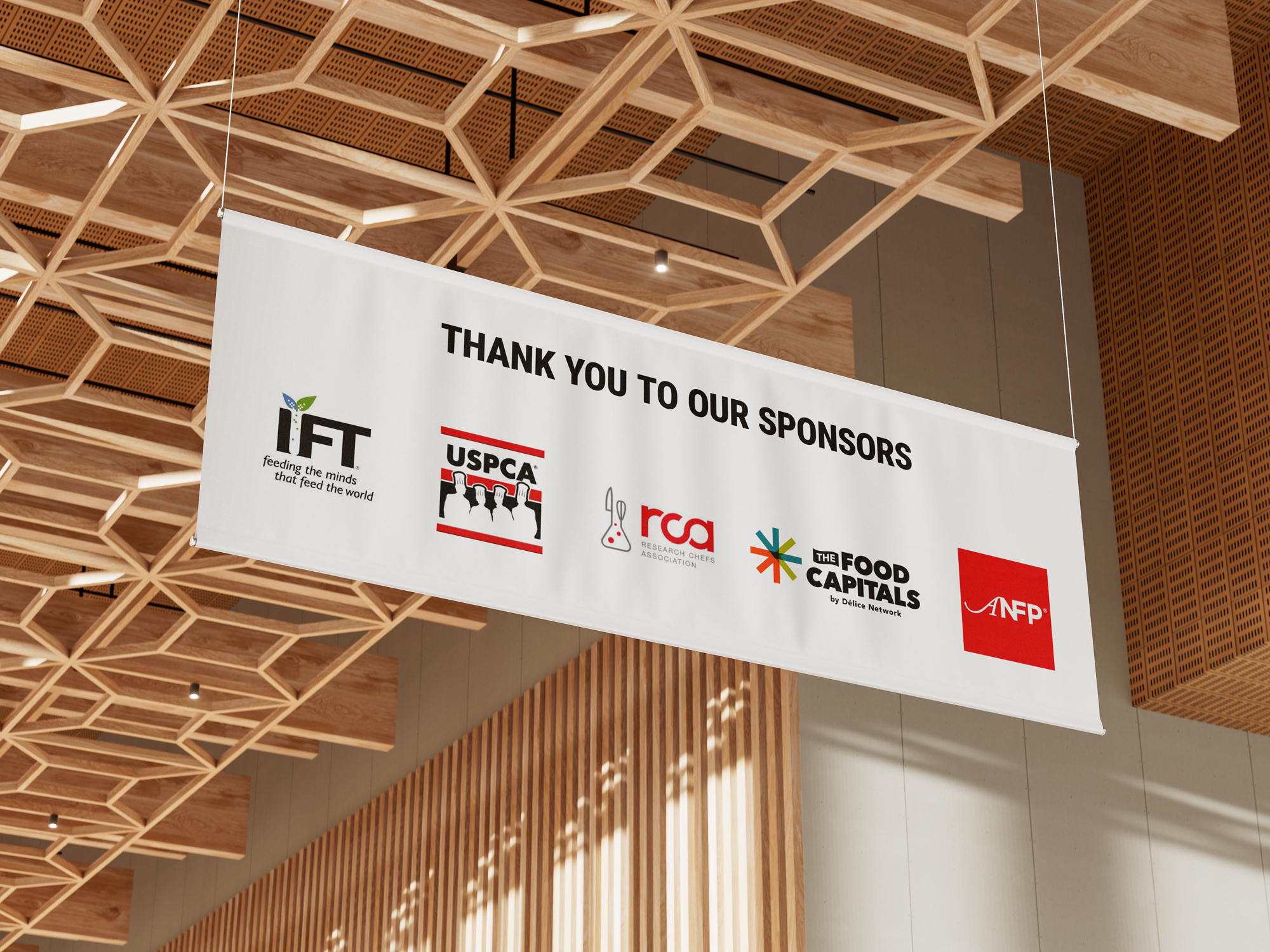
Logo Breakdown
The logo itself is split into 3 parts, each with a different meaning, adding up to the whole mark.
The star as a whole is meant to represent the endless possibilities of international cuisine.
Inside the star is a F and a C, representing the name Food Capitals. Additionally, the arrow in the bottom left is pointing up to the right, representing upward forward progress. Part of the Food Capitals mission is to gather international resources to solve food challenges such as sustainability in farming.

Logo Development
There were many experiments while developing the final logo system. These are just a select few options that were considered before the final logo was developed and presented. These rudimentary ideas ended up translating into the final logo in one way or another.
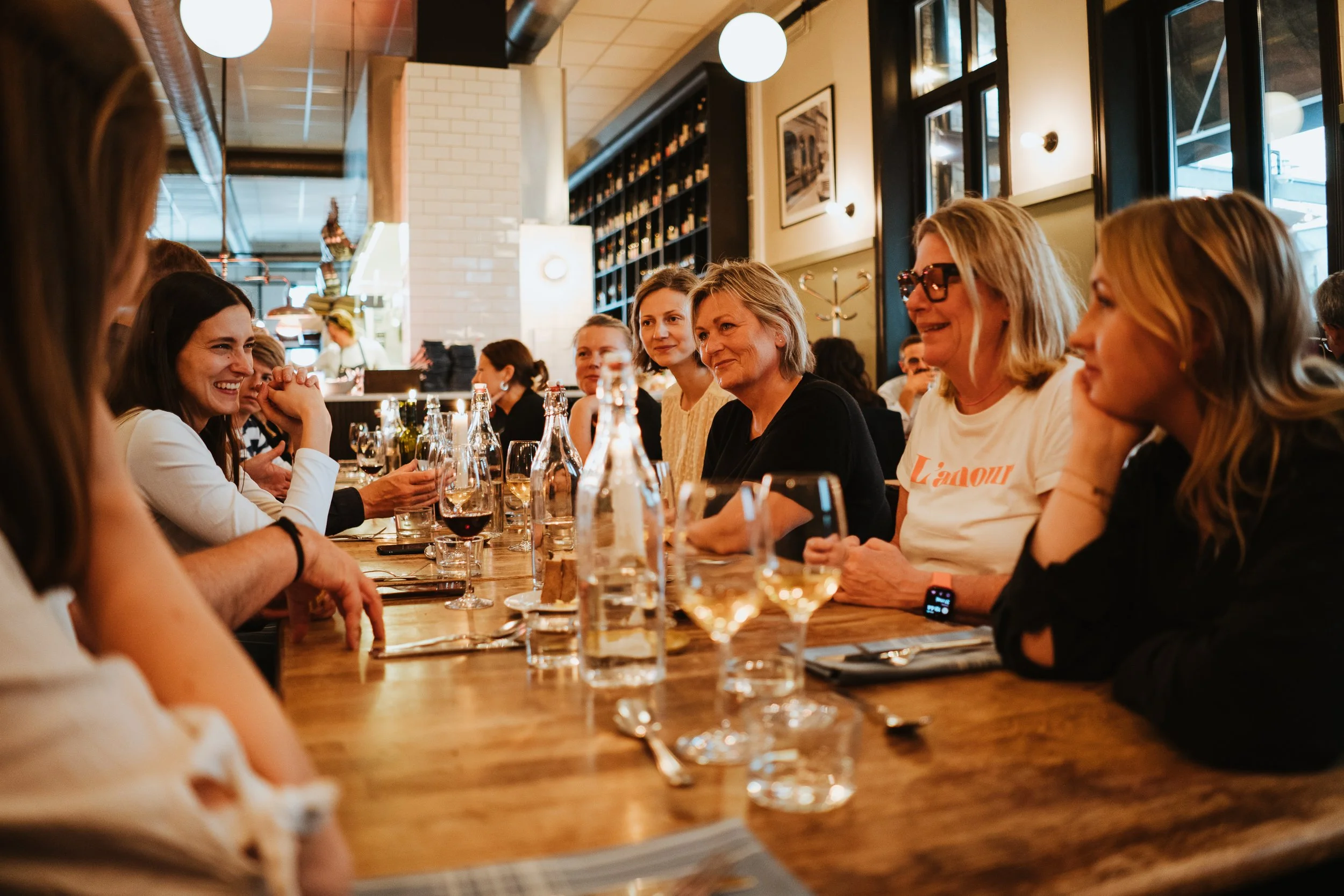
Present in many of the logo ideas was some form of the idea of coming together. Due to the unique nature of Food Capitals, being a global organization, there was no one way to showcase food that would feel universal. So the idea of food was abstracted into feelings of collaboration, togetherness, and the physical act of gathering at a table and breaking bread together.